Pentagram Delivered the Generator With the Logo
Pentagram built De Bijloke a fluid identity and a simple generative tool its single in-house designer can operate without returning every motion job to the agency.
Archive
IRZ Creative archive, page 3.
Pentagram built De Bijloke a fluid identity and a simple generative tool its single in-house designer can operate without returning every motion job to the agency.
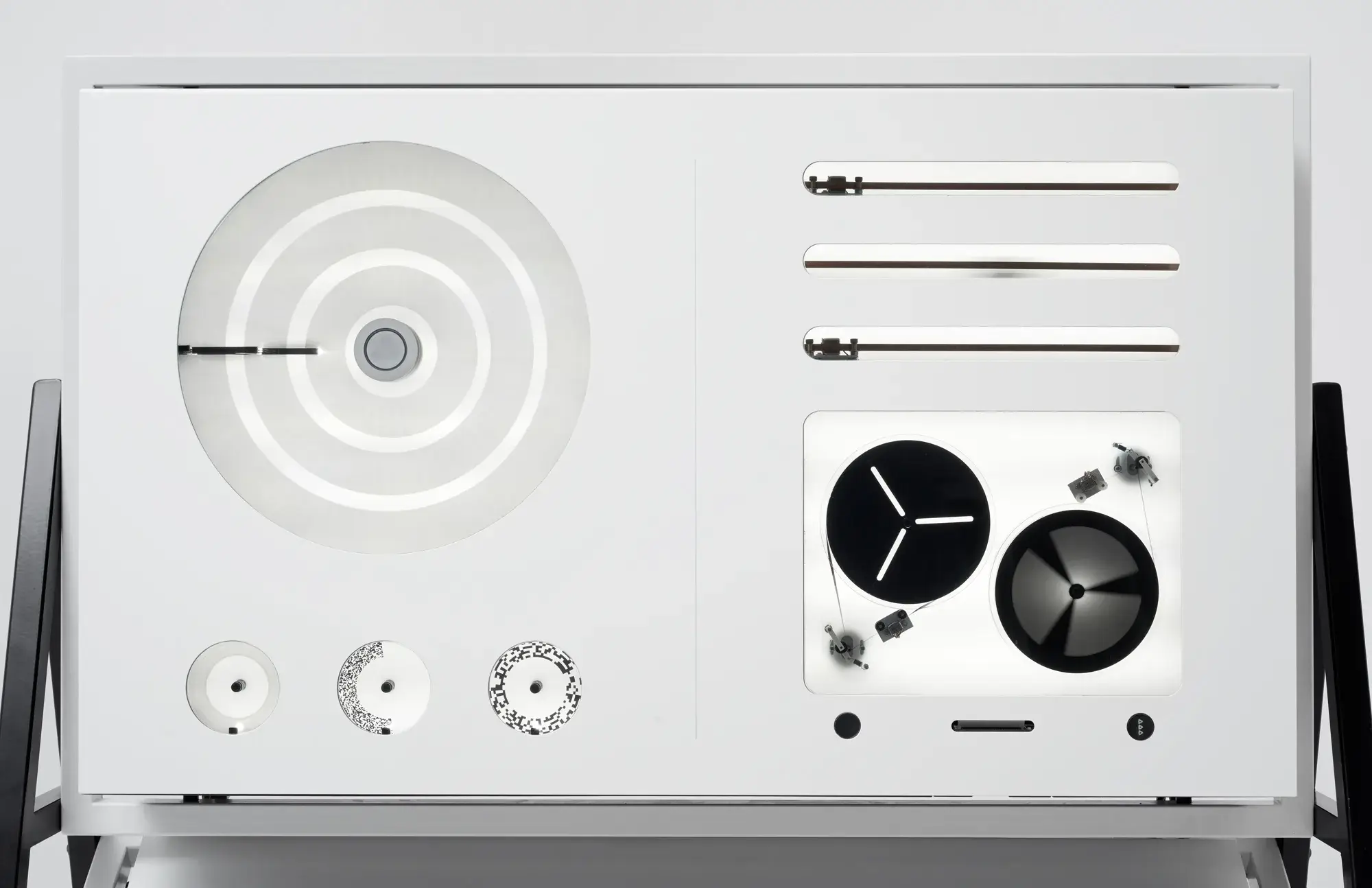
APPARATUM begins with a score assembled on a screen, but its sound is generated by real magnetic tape, motors and moving optical oscillators.
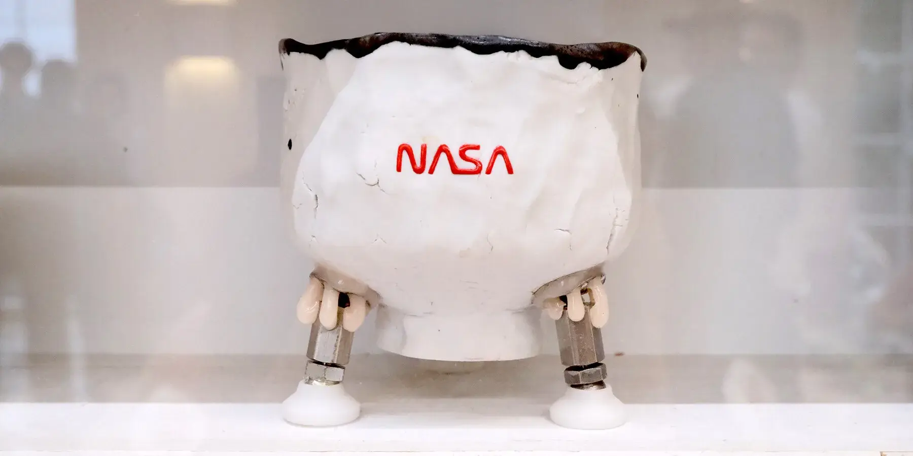
Cracks, blackened rims, gauze and visible repairs remain in Tom Sachs's ceramics. The defect is not erased; it joins the manufacturing record.
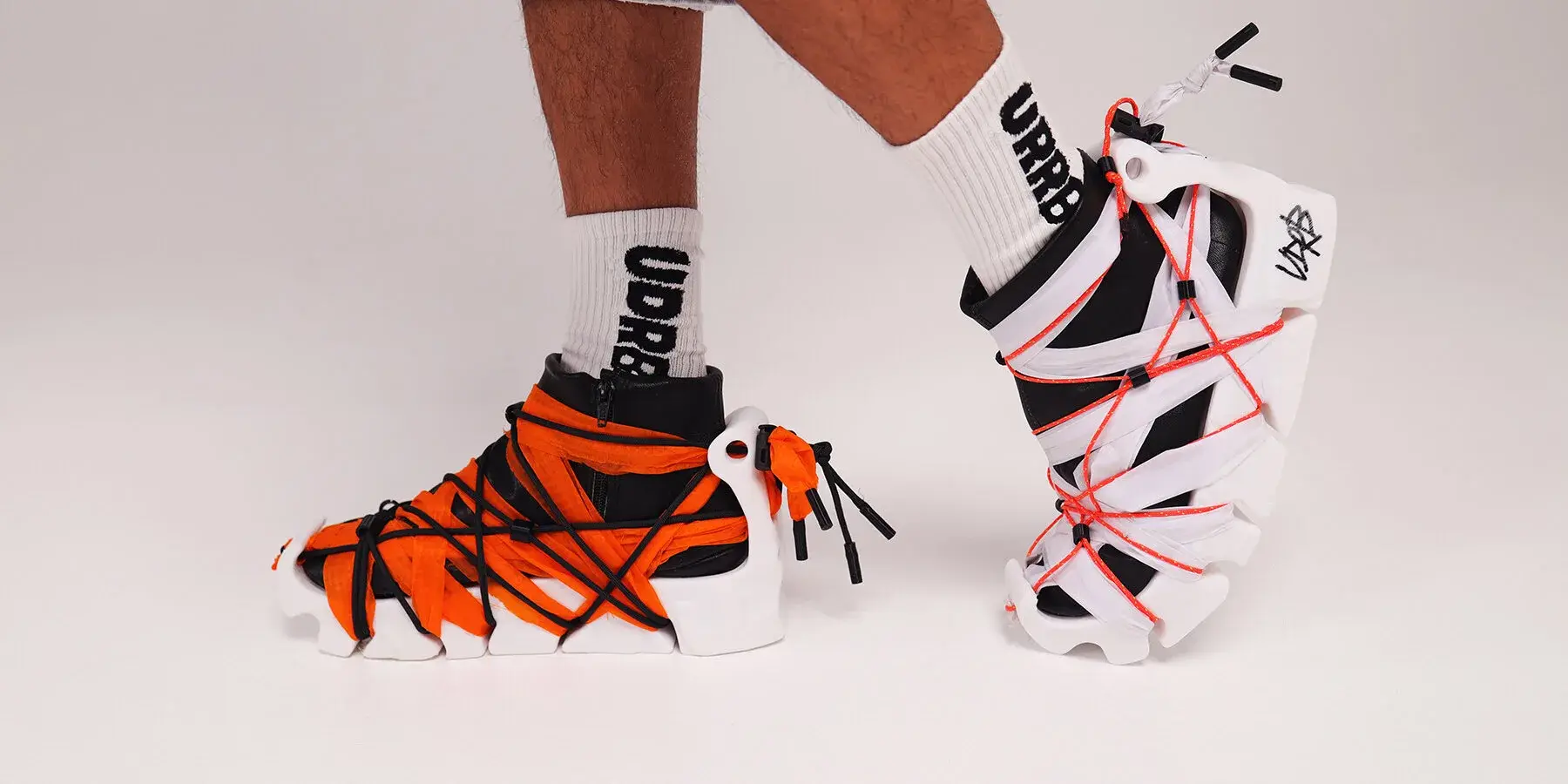
UDRB separates its printed sole, leather boot and rope fastening. Repair becomes a local mechanical problem, even though full circularity remains unproven.
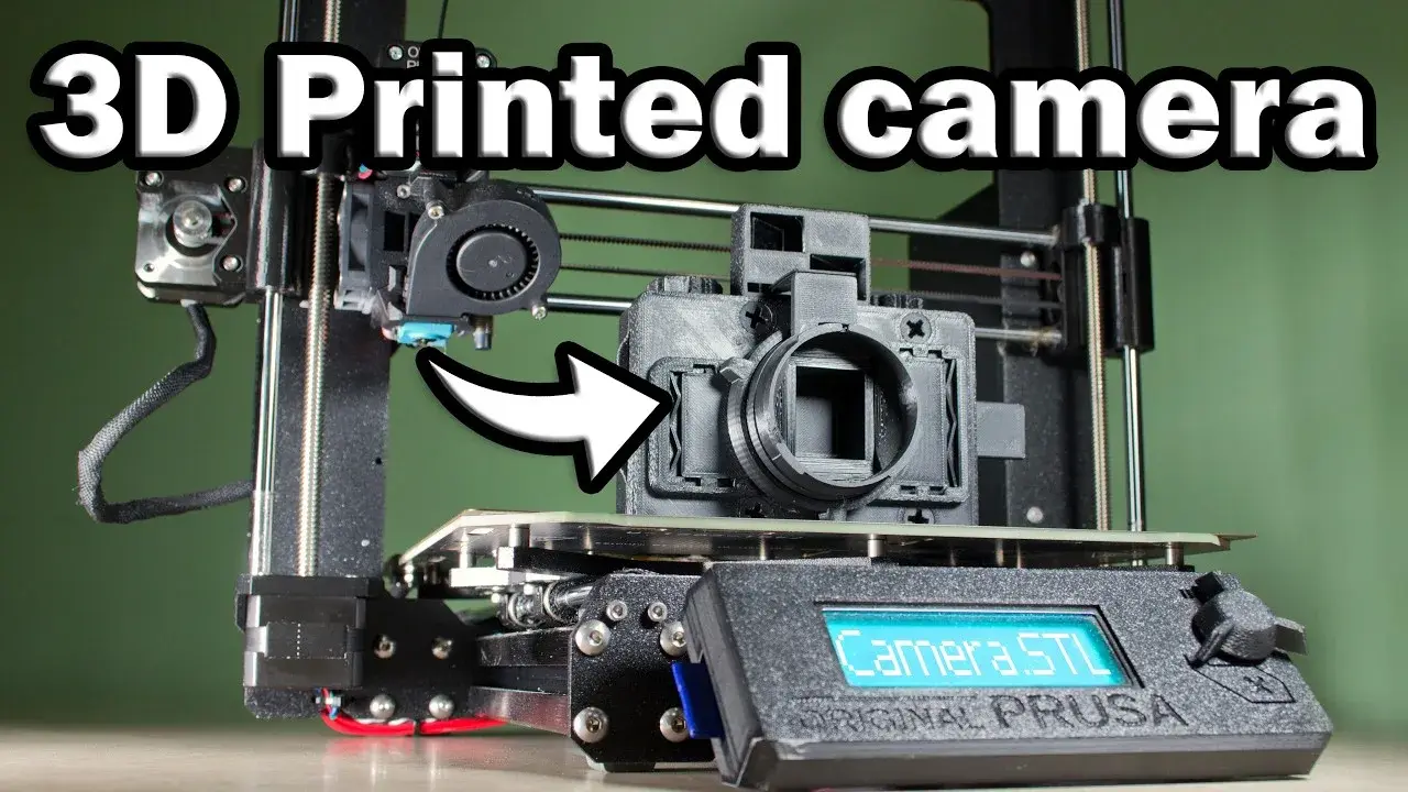
After three years of prototypes, Camera Things finally built a 3D-printed variable-speed shutter. Then he abandoned the mechanism: it works, but its geometry scales badly from half-frame to full 35 mm.
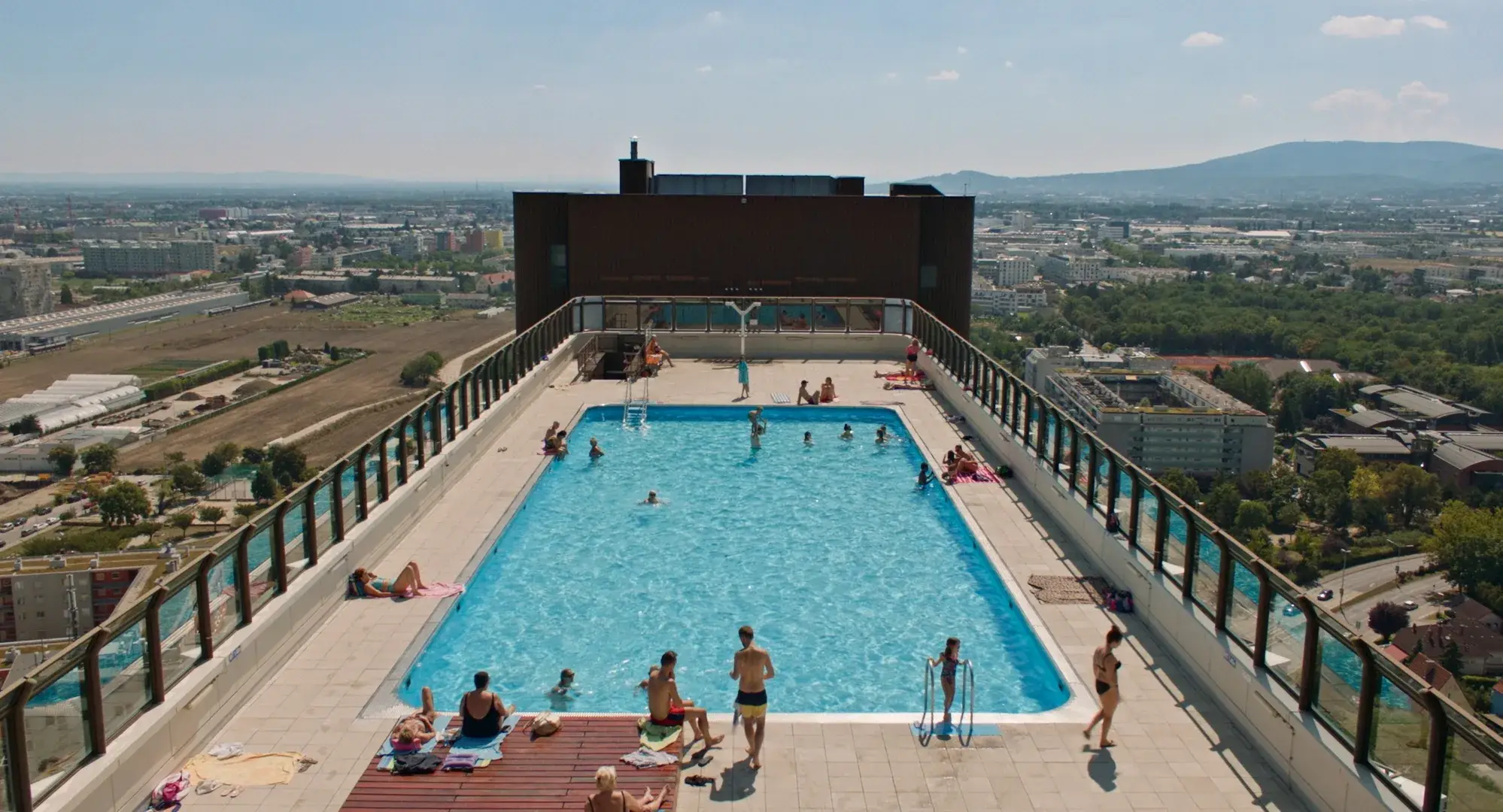
27 Storeys returns to Vienna’s Wohnpark Alterlaa. The lasting lesson is not the silhouette. It is the upkeep of clubs, pools, tenant boards and habits.
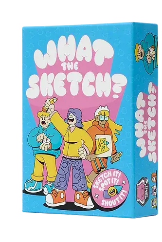
For What The Sketch?, Luke McConkey was not just drawing a funny box. He had to make a game of shapes, speed and guessing feel legible before anyone opened the rules.
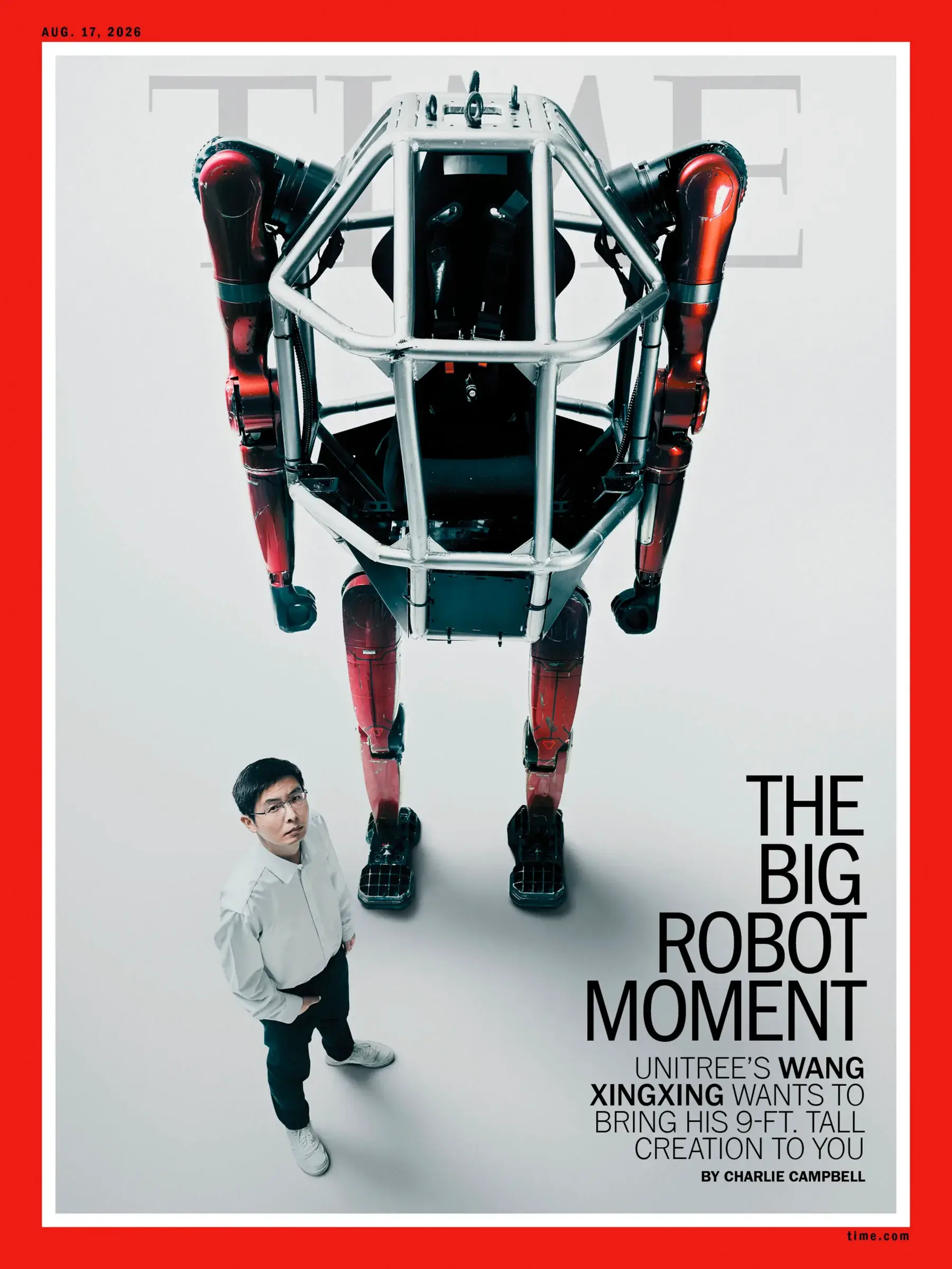
Mattia Balsamini photographs robots without adding a ready-made storyline. By keeping the bodies, places and people around them, he replaces sci-fi spectacle with an image of work.

In Lausanne, a seat folds under a small roof as soon as you stand up. The passive mechanism protects the wood, trading rain and dirt for springs, a hinge and one extra action from the user.
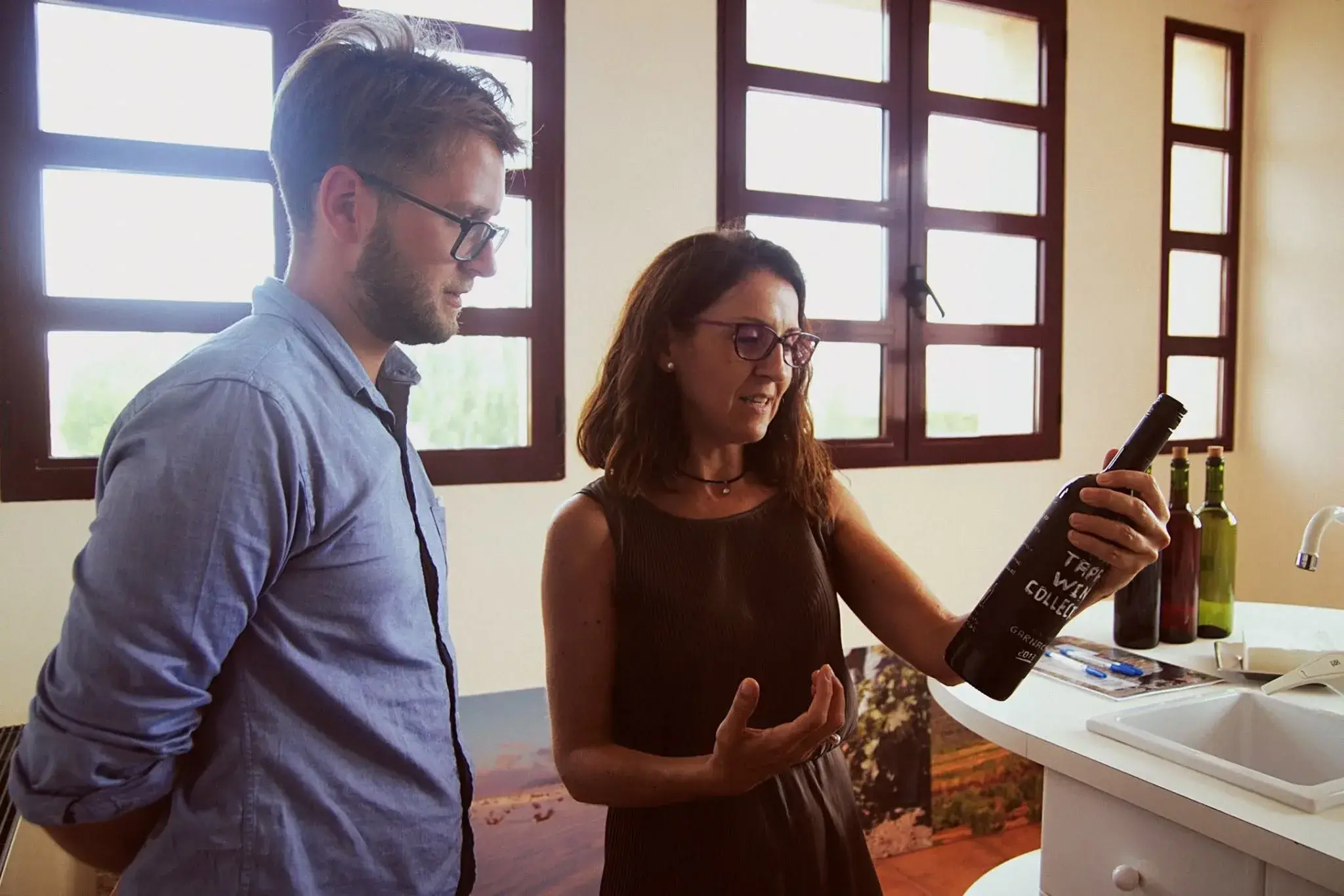
Andstudio is offering wineries an unusual exchange: no agency fee, but a week on site before four to six months of branding work. The real experiment is replacing the initial brief with fieldwork.