A "living" identity is easy to demonstrate in a launch film: a curve stretches, colours change and the logo breathes beside a carefully selected soundtrack. What happens after delivery is less photogenic, when the client returns to a calendar full of ordinary concerts and the elegant animation risks becoming another After Effects project nobody wants to reopen.
Pentagram tried something different for Muziekcentrum De Bijloke in Ghent: it delivered the tool that makes the variations as well.12
That detail changes the project because the logo, rather than remaining a shape controlled by Marina Willer and her team, becomes the input to a small generative system operated inside De Bijloke. There is only one designer on that in-house team, which makes the handover a design constraint in its own right rather than a secondary implementation detail.2
Eight centuries
The venue makes for an unusual branding problem because its main building was erected in 1251 as a hospital, hosted its first classical concert in 1988 and later became a municipal concert venue; over the last few decades, the structure has therefore acquired a musical identity without losing the physical evidence of its much older life. A major renovation completed in 2020, involving DRDH Architects and Arup Acoustics, brought the hall up to modern acoustic standards.3
Its programme is much broader than classical music. De Bijloke also presents jazz, contemporary work, experimental music, festivals and family events.13
Pentagram therefore faced a familiar cultural-brand contradiction: make eight centuries of history visible while keeping the institution from feeling frozen inside them, and reach new visitors without treating the loyal audience as a problem to be discarded. Design Week reports that the brief explicitly called for a less historical feel, since the venue largely attracted older generations despite programming a much wider musical range.2
The resulting position compresses that tension into one line: "Alive in Every moment. Past, present and future."1
One line
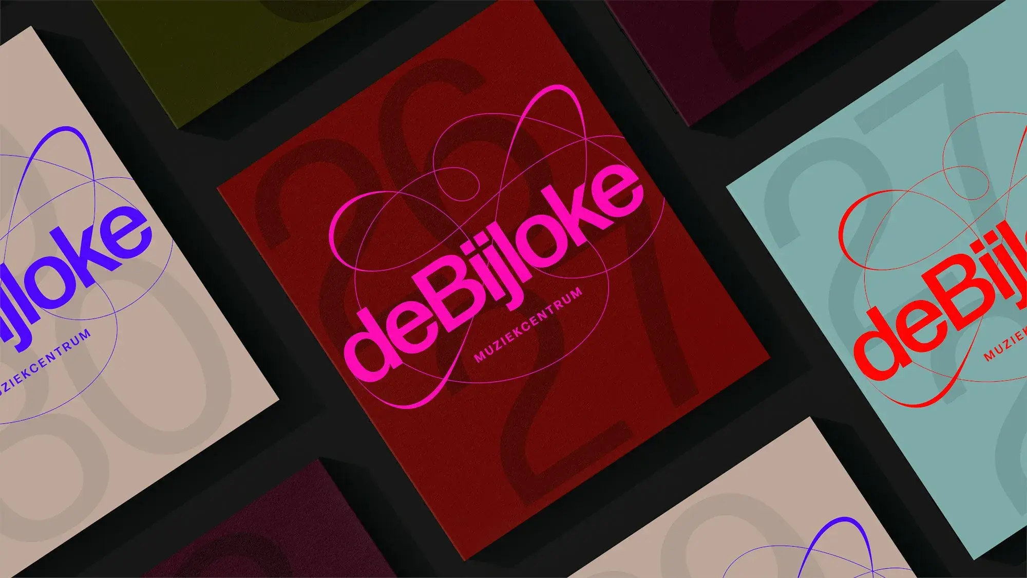
The main symbol is a continuous swooping line, loose enough to suggest movement but controlled enough to remain a mark. Pentagram names two important sources: John Cage's unconventional notation and the shapes produced by an oscilloscope, where an audio signal becomes visible.1
This was not a literal exercise in turning sound into a logo. In workshops with the client, Willer says, the team explored body gestures, dance, notation, doodles and signal displays; John Cage became one prominent reference, while the oscilloscope supplied a way of thinking about movement rather than a recipe for one fixed shape.2
By contrast, the rest of the system is deliberately quieter: Forma DJR provides the primary typeface, while colours are drawn from features of the building and set against brighter tones.12
That restraint matters. If every element behaves expressively, none of them gets to feel expressive for long.
Different genres
Pentagram does not force the same drawing to perform every kind of music.
The master mark remains the most controlled version and carries the general and classical-facing identity, whereas jazz and new music move closer to oscilloscope aesthetics: jazz stresses improvisation, new music pushes the original shape further, and the family programme loosens the gesture until it resembles a crayon drawing.12
A problem appears as soon as an identity branches this far. The further its variants travel, the harder it becomes to keep making fresh material unless the people using the identity understand the rules behind those variants, which is where this project becomes more interesting than its logo.
The generator
Pentagram created three patterns for the programme and a generative tool that reinterprets them through the jazz and new-music treatments. According to the studio's project page, the software produces continually changing forms, adapts them for motion and exports the results in any format.1
Design Week supplies the operational detail that portfolio case studies often omit. To be sure, this is not described as a giant procedural design platform: Willer says the software was deliberately built as the simplest generative tool suitable for the job because De Bijloke has just one in-house designer.2
That designer did not meet the system on delivery day. Willer says he was involved throughout the process, contributing alongside Pentagram's team and learning how to use the tools while they were being made.2
It would be easy to present this as a victory for generative design, but the evidence does not go that far. Pentagram has not published code, detailed parameters or technical documentation, leaving an outside reader unable to judge how deep the software really is; nor can a launch only weeks old tell us whether De Bijloke will produce equally strong variations two years from now.
What we do know is who has to operate it, why it was simplified and how that person was brought into its creation. That is considerably more concrete than saying that a brand system is "flexible."
The handover
A generative identity creates a question that static identities can often avoid: who authors the next image?
When the answer remains "the agency," the system is dynamic chiefly during its launch campaign. The client may own the files while lacking the practical ability to make the next convincing expression of the brand.
De Bijloke tries to reverse that relationship. Pentagram still defines the visual architecture, but part of production moves toward the venue's own team; relative to a conventional asset handover, the generator matters less for the number of shapes it can make than for the design decisions it makes repeatable from one poster to the next.
For small creative teams, the cost of complexity is often paid after the agency has left. Tool sophistication is therefore not measured only by the number of parameters on screen; it also shows up in whether the tool remains useful once the people who designed it are no longer in the room.
Pentagram drew the logo. The more difficult design decision may have been what to deliver with it.