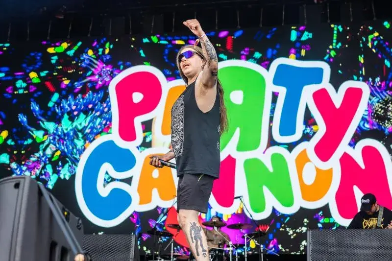
On a death-metal festival poster, Party Cannon looks like a printing mistake. Between black thorny logos, the Scottish band drops rounded rainbow letters that could have escaped from a children's birthday invitation.
Design conferences turned that contrast into a branding case study. The band tells a less strategic story: nobody began with a master brand plan.1
The founding joke
Bassist Chris Ryan says the name came from a story by their original singer, who wasted money on a novelty party cannon that did not work. The joke became a song title, then the band's name.1
The physical language grew in much the same way. Bailey Junior, who has taken charge of stage props since around 2021, works with cardboard, EVA foam and materials from hardware shops. The small budget is not hidden behind fake polish. It becomes part of the look.1
Then come bananas, inflatables, a mascot and deliberately stupid props. Fans now arrive in costume and perform the joke back at the band.
That is more interesting than the logo alone.
Coherence arrived afterwards
Party Cannon did not draw a brand manual and ask an audience to follow it. They repeated a set of choices until a language emerged: childish colour, crude humour, visible DIY construction and a deliberate mismatch with the aggression coded into the genre.
Ryan stresses how accidental much of this was. Bailey even says fans sometimes overanalyse props that were made simply because they were funny.1
For a small studio or project, that is useful. A strong identity does not have to arrive complete in Figma. It can grow from a repeated constraint, one odd detail worth keeping and enough consistency that other people eventually learn how to play with it too.