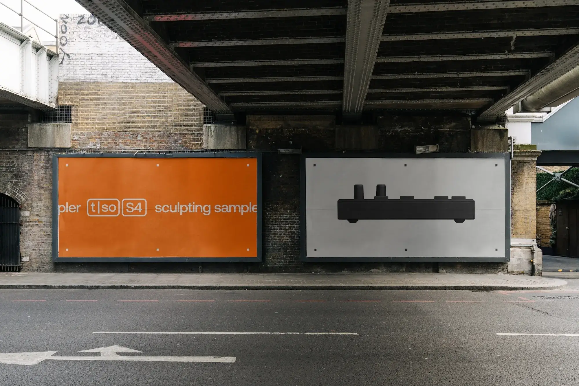
Torso Electronics did not necessarily need a new logo. The electronic-instrument maker mainly needed to stop deciding what the company should look like from scratch every time it made something new.
In an interview published by The Brand Identity, the team describes a long DIY period in which it built the instruments, packaging, website and much of the communication itself.1 Torso now documents its instruments on its own site2, while Ozon lists the project in its portfolio.3 That created ownership, but every new project could begin from an almost blank page.
Ozon Studio initially explored broader, more expressive and generative directions. Then it did something less theatrical: it looked harder at what was already there.1
The designers say they used the instruments, studied their interfaces and looked at the balance between immediate physical controls and deeper digital possibilities.1 The small vertical line inside t|so becomes both divider and connector across layouts, iconography and motion.1
The system continues into boxed notation for model names, Aeonik for more expressive communication and Px Grotesk Mono for technical information.1 Icons reuse the same weight and spacing logic across communication, digital interfaces and the hardware itself.1
None of that proves a “coherent” identity sells more instruments or automatically makes the product better. Those are design intentions described by the studio and client.
The transferable idea is smaller and more useful. When a product already has a particular way of behaving, branding can start by observing it instead of covering it with a new personality.
For a small studio, that also avoids an expensive reflex: searching for a new character when the project may already contain one in its buttons, materials, documentation and constraints.