Teddy Blanks did not begin the Barbie logo inside Illustrator; he ordered Barbie magazines from the late 1980s, then bought as many dolls and related products as he could find on eBay from the mid-1970s through the early 1990s. What he wanted were their names — Barbie, Ken, Skipper and others — each drawn in a variation of the same lettering language.1
Together, those artifacts gave him roughly half an alphabet, leaving the rest of the job as reconstruction.
That project captures a method Blanks, co-founder of New York design studio Chips, uses repeatedly in film titles. He does not begin with a mood such as “retro,” “medieval” or “unsettling” and then find a typeface that looks approximately right. He looks for a real object connected to the film, specific enough to supply forms, texture or a drawing rule, and only then starts extrapolating.14
The distinction sounds small, yet in practice it turns decorative reference into provenance.
Half an alphabet
Mattel had retired the logotype used for the Barbie film more than thirty years earlier. Vector versions already circulated online, but Blanks says many came from Illustrator auto-traces that lacked the fidelity required for the movie.1
He therefore went back to physical sources: an old magazine supplied a large enough version of the logo to redraw cleanly as vectors, while doll packaging added character names custom-lettered within the same visual family over many years without ever forming one complete, stable typeface.1
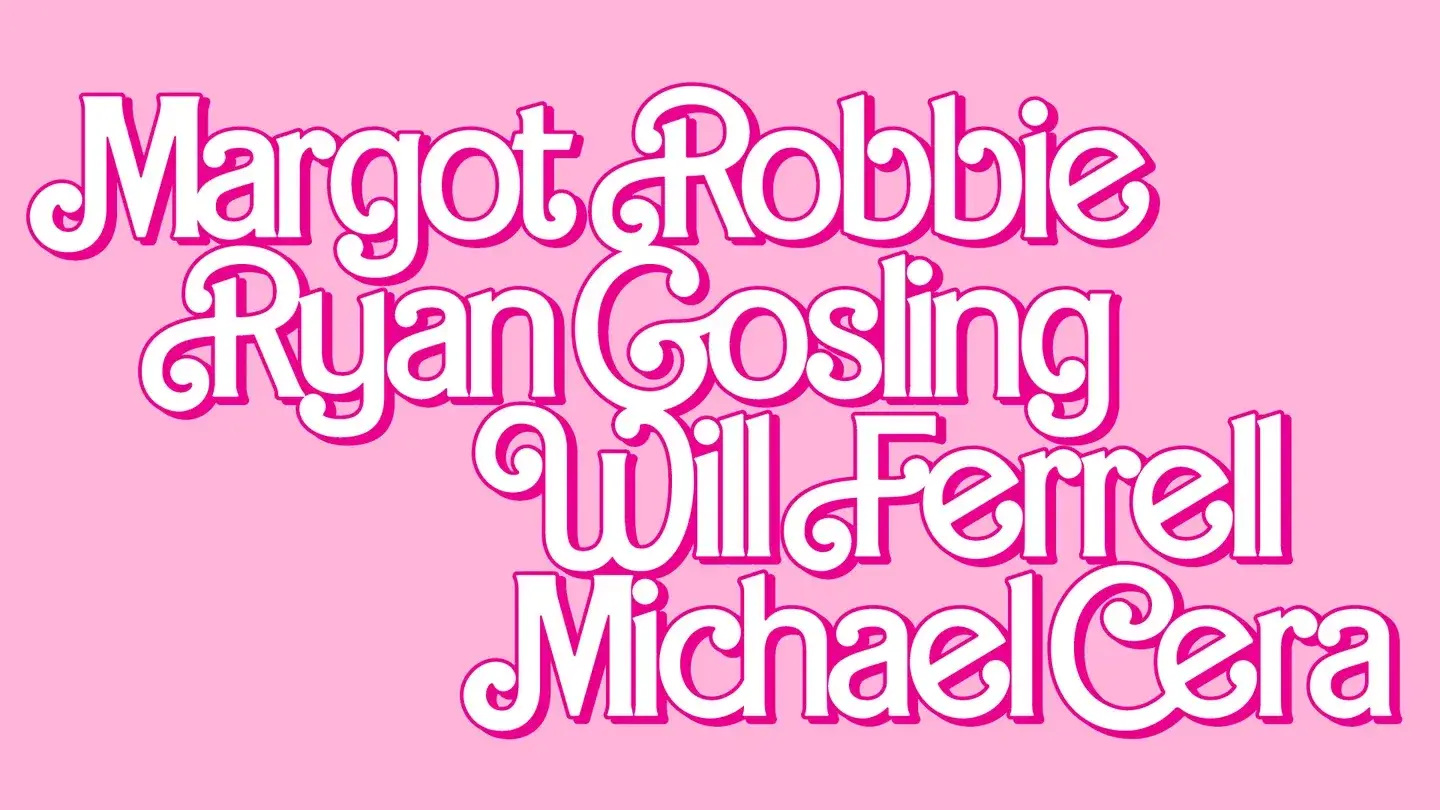
Had a clean historical font file existed, the job would largely have been to use it. Here the surviving letters instead behave like measurements — stroke width, loop shape, terminal angle, the way one character connects to another — from which missing characters have to be inferred.
Chips indeed credits a custom typeface, alongside opening titles, end credits and other graphics.2 The output is digital, but the starting point was a collection of printed objects.
Find an object
In an interview published a few months earlier, Blanks described his general process with much less mythology. He first watches a cut and notes anything useful about setting, period, characters, dialogue, themes or imagery. A conversation with the director follows, then research through book covers, artwork, printed material and earlier film titles.4
The moodboard, in that process, follows the film rather than preceding it as an autonomous starting point.
That order avoids a familiar trap. A search beginning with “medieval” can produce twenty interchangeable faux-Gothic alphabets, whereas a dated, located source tied to the story narrows the field before drawing even begins.
Robert Eggers' Werwulf makes the method almost literal. Eggers had already found a 14th-century manuscript whose lettering he liked and assembled an early version of the word himself in Photoshop. Blanks worked from that proposal, searched for a stronger W, and redrew the result by hand in Procreate.1
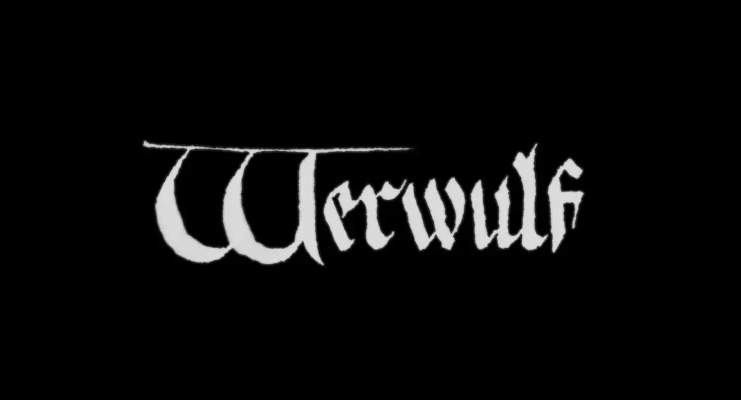
Even the roughness came from a document. Blanks scanned a blank sheet from a manuscript of the period and used that texture as a Photoshop displacement map. Lighter and darker areas nudged the type image, allowing irregularities in the paper to deform the letters.1
A displacement map is ordinary Photoshop machinery; the distinctive decision is the file chosen to drive it.
Invisible source
The archive does not have to be recognised by the audience. For Nickel Boys, Blanks researched the real hand-painted signs from the Dozier School for Boys, the segregated Florida reform school at the centre of the story, while being explicit that nobody can look at the finished titles and identify that reference.1
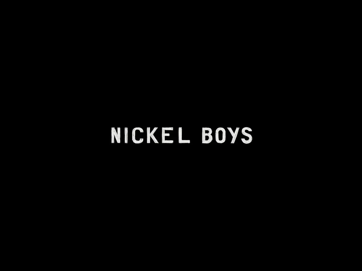
This may be the most transferable part of the method: a reference need not function as an easter egg, because it can simply stop the designer from inventing in a vacuum. The viewer may never know where a shape came from, while the designer knows why it is there.
The same logic works outside film. A palette drawn from paints actually used in a workshop, a grid derived from a cadastral plan, a motif taken from an industrial tool or an interface shaped by an old form need not be recognisable; its value lies in introducing constraints that did not arrive from a trend engine.
Local coherence
Blanks also had to unlearn part of his graphic-design training.
For The Green Knight, David Lowery returned to several directions from the first presentation and asked him not to choose one. Every chapter card should use a different font, colour and treatment while staying somewhere inside the medieval visual space.1 Chips' project page likewise presents a set of varied titles and intertitles for the adaptation of the 14th-century poem.3
The idea runs directly against branding reflexes — establish one voice, limit variation, make every element look related to the last — and led Blanks toward a different rule for film: judge a title at the precise moment it appears, with the music, image beneath it, black frame, edit rhythm and position in the story.1 Local decisions can therefore be more appropriate than a perfectly consistent global system.
That does not amount to permission for randomness. The variations still share a documentary world, but they stop treating a graphic standard as more important than the film.
Useful accident
The title for Weapons provides a funny counterexample to all that deliberate provenance.
Blanks simplified an early logo that director Zach Cregger felt was too ornamental and put a small triangle inside the O, referring to a bell carried by a character. Cregger called almost immediately: the film deals in part with alcoholism and addiction, and a triangle within a circle is also historically associated with Alcoholics Anonymous.1
Blanks says he did not know about that connection, so the meaning did not come from perfect research; it emerged accidentally because a sign already present inside the film carried more history than the designer realised.
The accident provides a useful correction to the method because a concrete source never guarantees control over every meaning; it mainly guarantees that you know where you started.
Before the font
Teddy Blanks' method can be stripped of movies, dolls and manuscripts: before searching for a form, find something that actually existed in the world of the project, build a corpus small enough to understand, observe its rules rather than just its appearance, and reconstruct what is missing. Fidelity to context may produce less graphic consistency than a system invented from scratch, and that is not necessarily a loss.
For Barbie, that principle sent a designer to eBay to buy dolls in search of letters.
The gesture can look excessive when a prompt can produce fifty “1980s-inspired” directions in seconds. Its purpose, however, is not to multiply options; Blanks uses research to create fewer arbitrary reasons for choosing one.