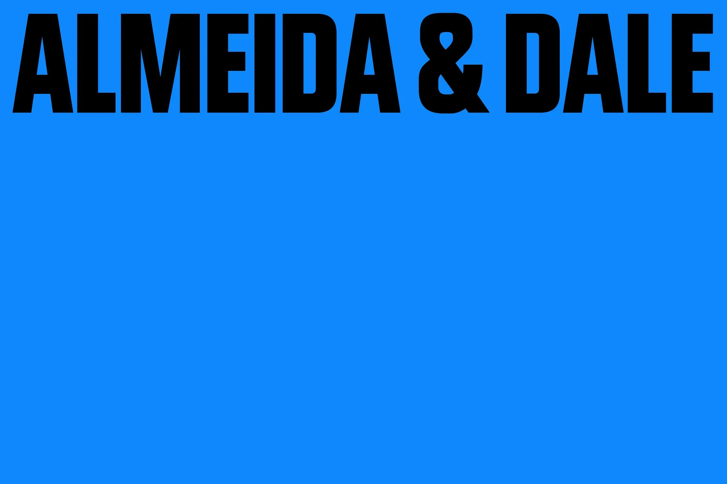
In many typefaces, accents arrive with the energy of an administrative requirement. The letter exists first, then someone remembers the ã, ç and é.
For Almeida & Dale's new identity, Porto Rocha worked in the other direction.
Its custom Diakritik AD typeface was designed for Brazilian Portuguese, with diacritics drawn at the same weight as the letterforms.1
Language from the sketch
Porto Rocha developed Diakritik AD with type designer Marek Nedelka. BP&O describes a condensed face with cues from mid-century typography and a more contemporary geometric construction.1
The useful detail is not the historical reference. It is how the system treats language.
An accent is not a tiny tolerated part sitting above the main character. Its weight and presence contribute to the identity's voice.
For a Brazilian gallery, that avoids a common oddity in international design: build the identity around an implicit alphabet first, localise it later.
An identity after a merger
Almeida & Dale was established in São Paulo in 1998. The gallery says it completed its merger with Galeria Millan, founded in 1986, in 2025 and now represents more than 50 artists and estates.2
The redesign therefore arrives as the organisation changes scale.
Diakritik AD is paired with Tightype's Bull-5, which draws on typewriter-like labels from 1980s American newspaper archives. The broader system also uses dynamic grids, large shifts in scale and full-bleed imagery.1
The identity can be loud when it needs to identify the institution, then move back when the artwork needs the space.
Localise before exporting
There is a broader lesson here than one gallery rebrand.
A custom typeface can easily become a style demonstration. One of this project's most distinctive decisions instead lives in signs that many teams treat at the end of the job.
It reverses the order: draw the language that will actually be used first, then build the international system around it. The accent stops being a correction. It becomes a letter with slightly more plumbing on top.