An orchestra almost always needs a building to exist in the public’s imagination: a hall, a facade, an address.2 Orkest Phion has none of those.1 The ensemble formed in 2019 from the merger of two Dutch orchestras plays in Arnhem, in Enschede, in other cities, then abroad, without ever settling in one permanent home.28 When Amsterdam studio Thonik was brought in to rebuild its identity, it drew the logical conclusion: if recognition could not come from architecture, it would come from typography.46
The vehicle for that bet is a variable font, GT Planar from the Swiss foundry Grilli Type, whose slant axis spans 90 degrees.3 It is this typeface that stands in for the “score”: every poster is composed the way a piece of music is, and the angle of the letters tells you what the music does.
No facade to recognise
Most symphonic ensembles lean on the status of a venue. Phion does the opposite: it moves between the provinces of Gelderland and Overijssel and regularly tours abroad, producing a new campaign for each city and destination.258 For anyone running its communications, that is constant pressure on the identity.
Falco van Burg, Thonik’s design lead, told The Brand Identity that the brief was direct: “They wanted to reach the audience every cultural organisation is chasing: the creative omnivore.” The point of the new system was never framed as an aesthetic search — it was an answer to a specific audience.4
The obvious first answer, photography, was rejected by the studio itself. Van Burg’s reasoning: “A photo of a musician doesn’t say much to us. What they play does.” A picture of a performer says little; what they play says everything.4 That sent Thonik toward the letterform — and toward a typeface capable of moving like the music.6
Ninety degrees of axis
GT Planar is not an ordinary typeface with a few italics. It is a variable family built around a continuous axis: the design slides from upright into italic, leaning progressively to +45°, and all the way back to −45° in the “retalic” styles Grilli Type names in deliberate contrast to italic.3 On the foundry’s website the axis is marked at -45, -30, -15, 0, +15, +30 and +45 degrees, and the weight runs from Thin to Black — all within a single design space.3
The studio sums up its ambition as “Swiss Futurism”, a claimed kinship with Swiss modernism pushed into a dimension of movement. It is this tilt coefficient Thonik exploits, rather than weight alone, to build its “score” across campaigns.3
Van Burg explains what the slant unlocks: “GT Planar has details that only appear when you slant it. The moment the type tilts, extra forms come out that emphasise its character, and you can feel the typographer knew exactly how it should move.” In other words, some parts of a letter only exist when viewed at an angle — a property tied directly to how the axis was drawn.356
Composed, not improvised
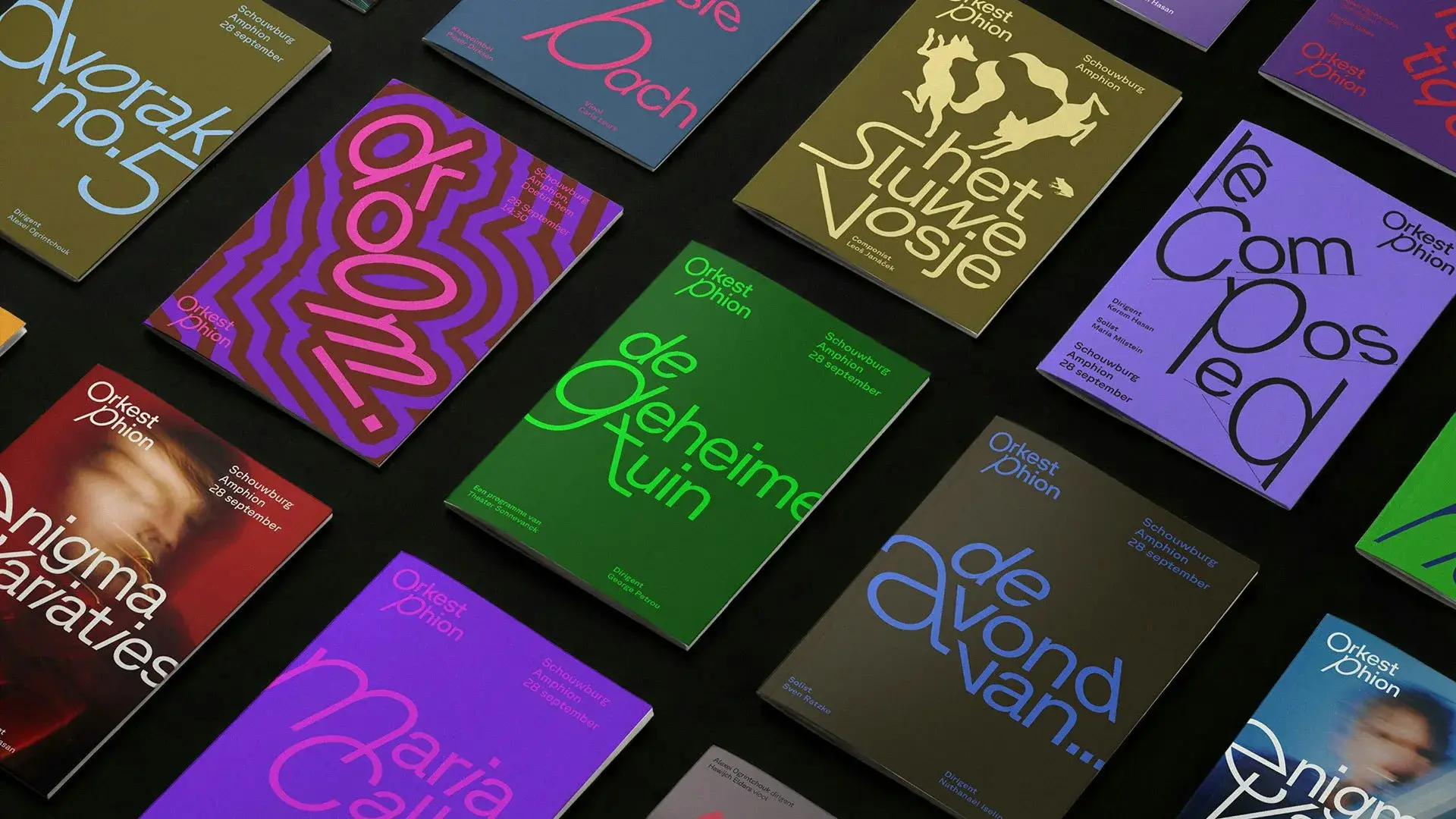
The structuring decision was not to fix a master template. Van Burg: “Before we design anything, we ask what the piece feels like. Calm or restless? Does it build slowly or hit you right away? That feeling is what we translate, not the information.” What gets translated is the feel of a work, not the practical details of a concert.56
The letters bend to the piece: “A restless piece bends the letters hard and breaks the word apart. A calm piece stays open and quiet.” Van Burg then pushes to the limit: “There is no master template waiting for the next programme. However energetic a title gets, it still has to feel composed, not improvised. That was our limit.”5
His best illustration is Stravinsky. The music is “fractured and irregular”, the rhythm keeps jumping, accents land where the ear does not expect them. Thonik broke the name into three parts, set on lines of different heights and angles so the eye reads it in fragments. Van Burg reads the two sides of a single name: “The ‘S’ is the soft, flowing side. The ‘y’ cuts down hard and sharp, the brutal side. Same name, but it holds both.” A composer like Mahler takes the same system the other way — broader, slower, more open.4
The foundations stay fixed: the logo, the weight, the grid. Only the expression moves, and it lives in the titles. One rule binds them: every title opens with a large first character, usually in lowercase.4 In its review of 1 September, BP&O names the governing principle more precisely: the first letter of a heading sets the direction and character of the movement for the rest of the word or phrase.7
Colour follows the photo
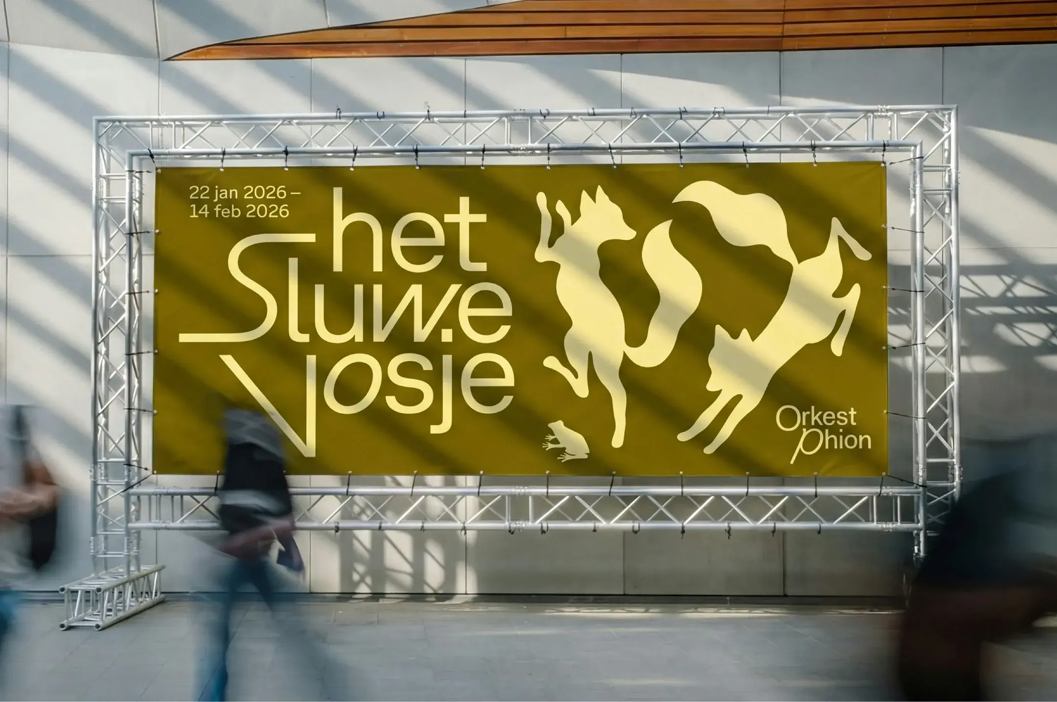
Type is not the only element holding the system together. Thonik extends the logic to colour: the studio takes the dominant colour from each photograph and applies it to the typography of that same piece of communication.7 The result is a strong visual tie between image and lettering, and, because the rule repeats, a constant thread across campaigns that otherwise keep changing.7
The whole thing amounts to what BP&O calls a rare economy: “Every single element works so very hard, and has been used for such a concrete and context-specific reason: things don’t move simply because animation is fun.” Nothing moves for the sake of movement; the motion is indexed to what Phion does.7
The sound, not the place
What makes the case worth examining, beyond the quality of the work, is the problem it sidesteps. A cultural brand that changes venue at every concert cannot bet on geography. Thonik answers by anchoring the identity in the orchestra’s own material: music.16 Grilli Type compresses it in a single line: “music, not the venue, is what unites the musicians.” For a touring orchestra, that reframing is the whole logic.91
The choice also states an honest limit. Any identity built on variable values has to balance a recognisable system against an animated gimmick. Van Burg admits the system produced versions that went “too far, too loose, too improvised, and start to feel like jazz instead of a symphony orchestra”.4 The “composed, not improvised” constraint is therefore real, and the outcome depends on holding it.5
Orkest Phion has used its short name since September 2025, and Thonik’s identity has been recognised (including a TDC72 award).18 What stands out is how simple the recipe is: no showpiece logo, one typeface, one axis, and the music as conductor. The missing building has been replaced by a score — literally.