Design uses “intuition” to mean several different things. Sometimes it is taste trained over years of practice; sometimes it is a decision made too quickly to reconstruct afterwards.
In Alina Derya Yakaboylu's work, the word enters late in the process.
The German-Turkish designer and art director starts elsewhere: research, conversation, institution, people, audience, place and collective memory.1 Her own website describes the same approach through three unglamorous but demanding habits: careful listening, holistic thinking and deep engagement with clients.2
For her, intuition does not replace collected material. It becomes useful when someone has to decide what to do with it.
The distinction looks small, but it changes the order of the work. A concept often becomes more specific when it grows out of real constraints than when a striking form appears first and the rationale is written afterwards.
Start with traces
Her master's thesis, which earned a Kulturpreis Bayern in 2021, shows the method in raw form, before it became portfolio language.
Her subject was Oberhausen, a district of Augsburg. She combined photography, graphics, experimental typography, interview fragments and screenshots to study it.4 Hochschule Augsburg describes the work as ethnological neighbourhood research joined to an artistic approach.
More importantly, she does not try to erase her own point of view. She takes the role of a flâneuse, walking through the district and building a deliberately subjective snapshot.4
She gives up an impossible promise: representing an entire district neutrally.
The same gesture appears in her teaching. Her website lists a 2025 workshop titled “Going for a walk as a creative search for clues.”2 Walking is not a break from the project. It is research equipment.
The designer therefore makes material worth looking at before choosing the grid, typeface or palette.
Context before style
In the interview published by It's Nice That in August 2026, Yakaboylu describes a concept-driven process built from conversations and questions about institutional identity, place and collective memory.1
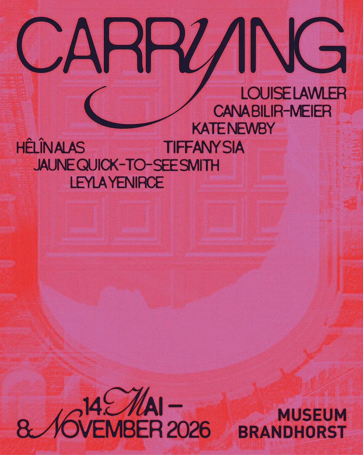
The Museum Brandhorst exhibition Carrying shows how that sequence moves into a real identity project. The exhibition starts from the idea that places carry histories, and the graphic work responds to that cultural and spatial context.1
Copying the visual result would miss the useful part. What matters here is the order of decisions.
The graphic language arrives after the question asked of the context. The project does not begin with “what form would look interesting?” but with something closer to “what already exists here that design should make perceptible?”
In her Everpress interview, Yakaboylu describes a similar habit: understand the people involved and the intended audience, bring social and political questions into view, then consider collaboration, sustainability and ethics.3
For a poster or identity, that field can look almost excessive. Its purpose is to stop the commission collapsing into surface too early.
Then intuition
No amount of notes, images or interviews composes the project automatically.
Eventually somebody must decide that one photograph is more useful than another, that a small detail deserves to become a system, that a historical reference overloads the project or that breaking the grid finally creates the right tension.
This is where intuition earns its place.
A 2021 qualitative study of twelve professional graphic designers describes intuition as a brief signal: sometimes it reinforces an ongoing decision; sometimes it pushes the designer back toward conscious reasoning.5 Participants used it when selecting information, filling gaps and evaluating what to do next during the creative process.5
The parallel with Yakaboylu is straightforward: research opens the field; intuition helps narrow it again.
The sequence also avoids the false duel between rational method and personal sensitivity. A designer can document a problem carefully without pretending that the final form is mathematically deduced from the evidence.
Two cultures, no recipe
Yakaboylu also discusses her German and Turkish influences. In the Everpress interview, she links her German education to typography, order and structure, while Turkish record sleeves, books and her father's art exposed her to ways of breaking that academic order.3
It would be easy to flatten that into a visual formula: Swiss order on one side, Anatolian expression on the other.
That would also be exactly the kind of shortcut her method resists.
Culture does not work like a texture added at the end. The transferable part of her method is a way of finding where culture already lives inside the project: people, habits, streets, objects, archives and contradictions.
That becomes crucial when a designer works with a place or community they barely know. A visual moodboard can show what a culture looks like from outside. Conversation and sustained observation can reveal what people inside it actually consider meaningful.
A useful constraint
The method has its own trap: research can become exceptionally well-documented procrastination.
The more material accumulates, the easier it becomes to postpone the choice itself. Yakaboylu even admits in the Everpress interview that she does not have a clean test for knowing when a piece of work is finished.3
That is where intuition gains an almost operational function: it closes some paths before definitive proof exists.
A small studio or independent designer can keep the useful part without turning every commission into a thesis: a few conversations, field collection, a visual inventory, then an explicit selection phase.
A useful rule might be this: do not ask intuition to invent evidence it has never seen.
Give it something to sort first.