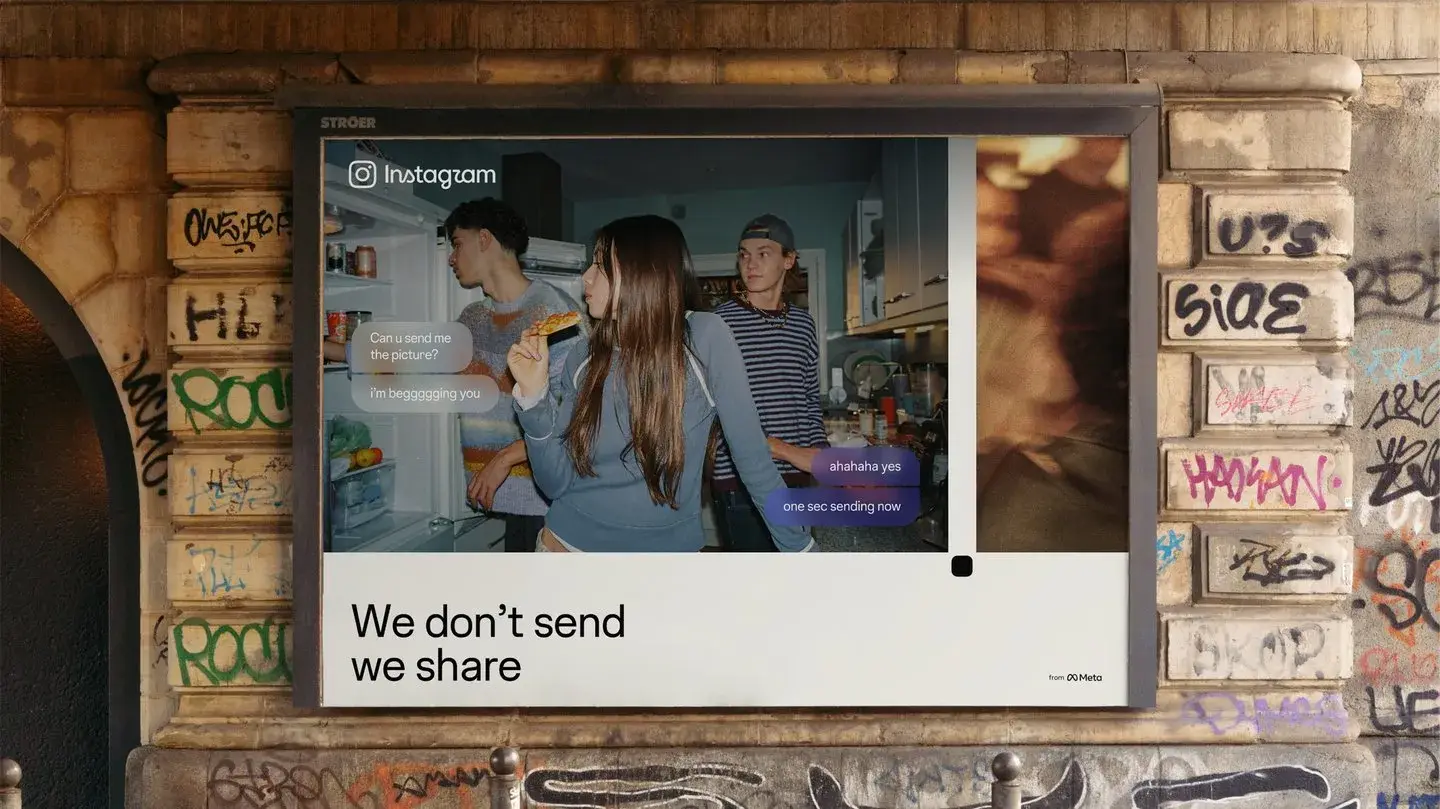
Instagram tried removing its script wordmark.
The result looked less like Instagram.
That is one of the most useful details in the new identity unveiled on 13 August 2026. The team says it explored hundreds of directions for the wordmark: all-caps, more literal camera ideas and raw handwriting. It also tried starting again without script.1
The more it removed, the less recognisable the brand became.2
The new system is therefore more interesting as a constraint exercise than as a conventional “rebrand.” Instagram had to change without losing two signs that fifteen years of use have made almost inseparable from the product: the handwritten name and the gradient.
The chosen solution is not to make them louder.
It is to make them more precise and, in some places, quieter.
Script as inheritance
Meta describes the change as the first major refresh of Instagram's identity in more than ten years.1
In an interview with It’s Nice That, brand design director Cynthia Pratomo explains that attempts to remove the script made the whole thing feel too unrecognisable. After more than fifteen years, the handwritten form is no longer merely a graphic choice. It is part of how people identify Instagram before consciously reading the word.2
So the team does not begin from a blank page.
It works inside a restrictive inheritance.
The new wordmark keeps the calligraphic logic while simplifying and strengthening several forms. Meta describes it as bolder and simpler while preserving some unexpected detail.1
That is not dramatic in the way a completely new logo is dramatic.
It is exactly the problem a designer faces when the previous sign already works too well to discard.
Redesigning an established brand can be less about drawing something better than discovering what you are no longer allowed to break.
A quieter gradient
The other untouchable element is the gradient.
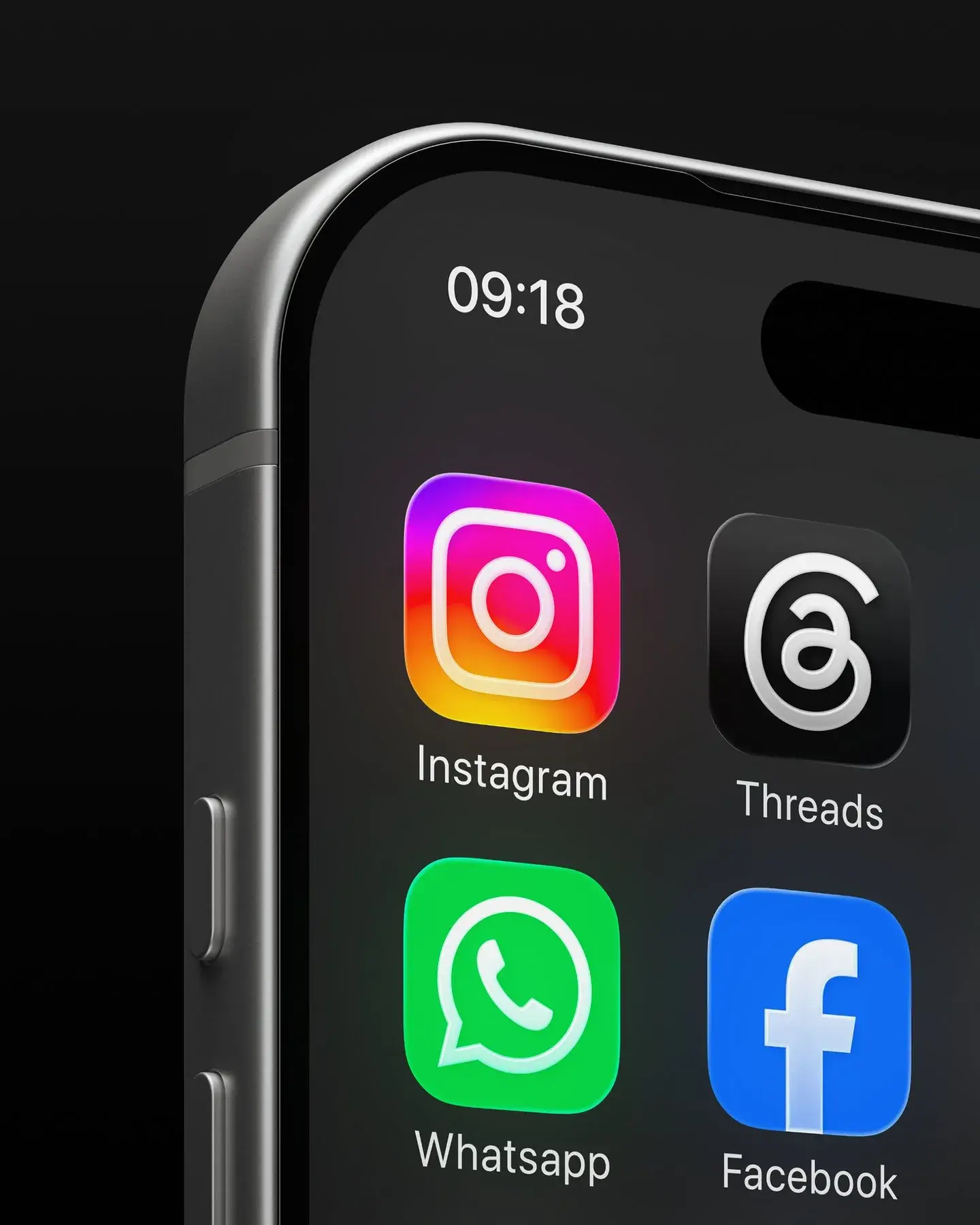
The gradient remains one of the core elements of Instagram's identity. The new system keeps it but Meta says it will be used more selectively, alongside refreshed rules for motion, layout and interface.1
It’s Nice That describes the same shift. The gradient can now appear more like a photographic light leak than an omnipresent digital background. An inverted green-and-blue treatment on black also broadens the system.2
The overall logic is almost paradoxical.
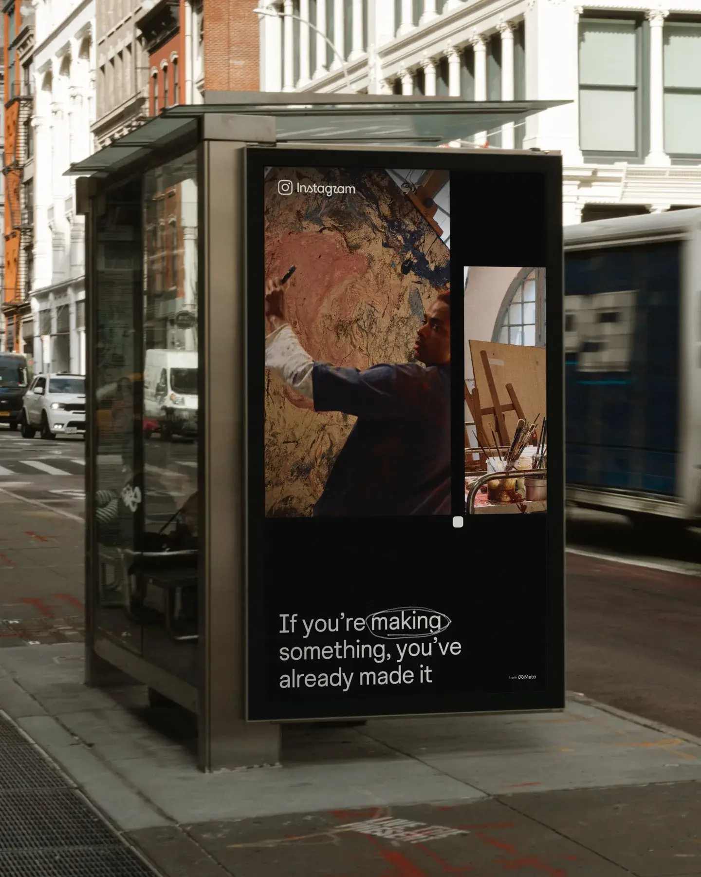
Instagram is redesigning its brand so the brand can take less visual space away from the images and videos made by users.
The official announcement makes the same claim: the system should create more room for the community's work to carry the energy.1
It is worth remembering that this is Meta describing its own intention. It is not an independent measurement of how people will experience the redesign.
But as a design constraint, it is useful. The identity has to remain recognisable while avoiding a visual fight with the millions of other identities it frames every day.
Handwriting, industrialised
The refresh also adds or updates three complementary type families: a revised Instagram Sans, a new Instagram Mono and the forthcoming Instagram Pen.1
Pen is the most revealing.
According to the team interviewed by It’s Nice That, the handwriting face was developed by testing different tools and gestures, from soft pencil to stronger ink marks, in search of what the company calls a collective signature.2
The idea has precedent. Instagram had already turned the handwriting of artists such as Rosalía and Olivia Rodrigo into typefaces people could use in Stories and Reels.2
Pen tries to make that logic part of the brand system itself.
There is something mildly absurd about a multinational industrialising “human imperfection” into a font file. But stopping at that joke misses the practical constraint. A platform containing photography, text, memes, video, messaging and creation tools needs typography that can move across tones without making every context feel like a different product.
The brand is no longer only drawing its own logo.
It is designing a toolkit for moments when its users become graphic designers for thirty seconds.
Photography without costume
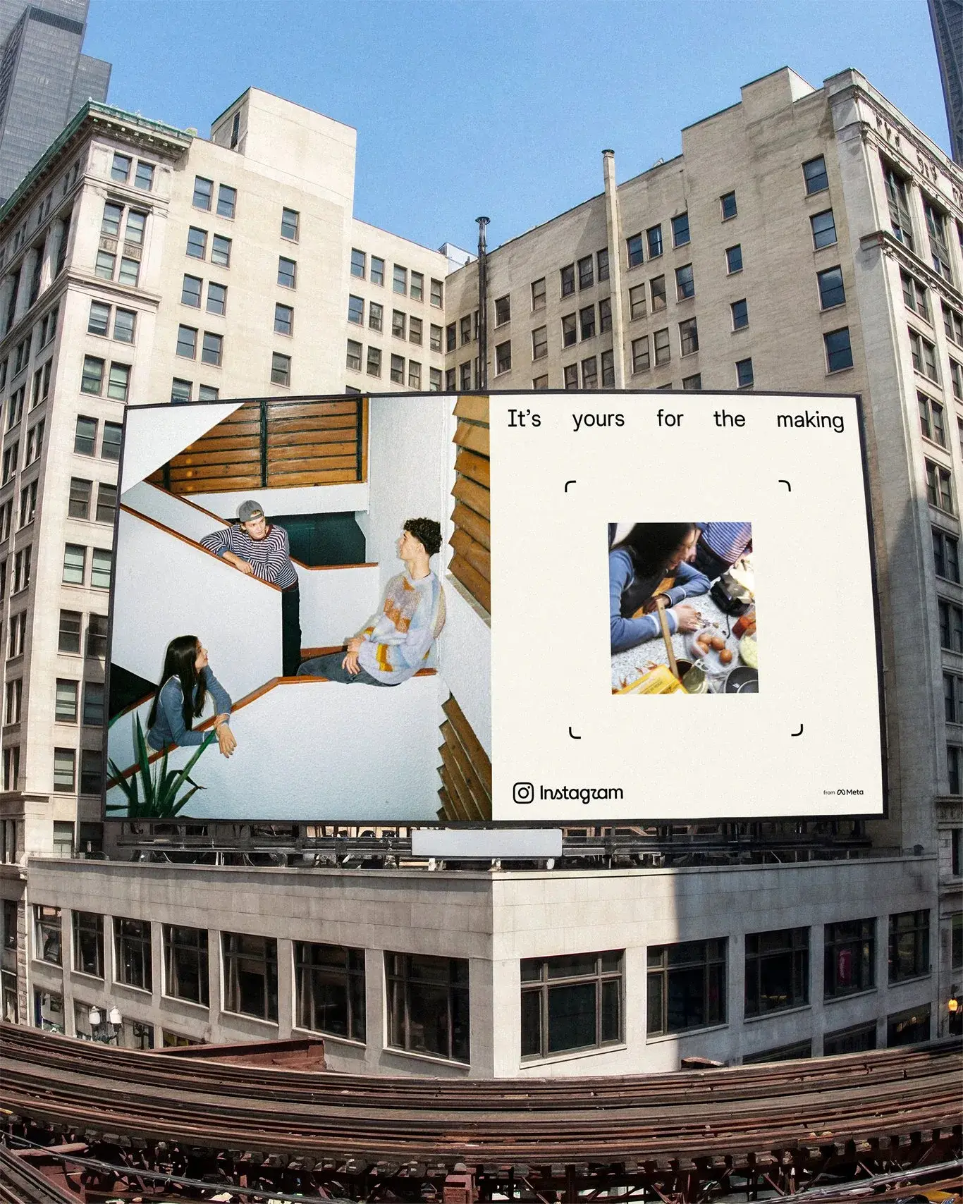
The new language also borrows from older photographic objects: contact sheets, registration marks, annotations and viewfinders.2
The viewfinder is derived from Instagram's camera glyph and frames imagery throughout the system. The team presents it as a reminder that a photo in the feed began as an actual act: somebody framed something before publishing it.2
That explanation is, naturally, very polished brand-interview material.
The process behind it is more interesting than the pitch.
Instagram is not trying to resurrect its old skeuomorphic camera icon. It is borrowing tools of image production rather than the nostalgic appearance of a camera.
That distinction matters.
A film-grain texture would simply decorate the identity. A viewfinder, annotation or contact sheet refers to selection, framing and sequencing.
The visual system therefore returns to photography through process rather than costume.
The invisible refresh
Not everybody likes the new wordmark. The Verge noted reactions criticising, among other things, its readability.3
A handful of social comments should not be turned into a global survey. They simply expose a familiar risk with a highly familiar identity: moving a sign that billions of people have learned through repetition can feel more disruptive than a much larger redesign of an unknown brand.
Instagram's team almost embraces the opposite effect.
The system is intended to act more like background infrastructure and leave more space for the content itself.2
That is an unusual position in an industry that often sells redesigns through presentation boards where every element has to shout that it changed.
Here, success might look like this: open Instagram, sense that something is slightly different, then return to looking at the photos before working out what changed.
The rebrand becomes less a new object than a new setting.
The old system still did a lot of explaining for the platform. The new one is trying to become an infrastructure flexible enough to support conflicting tones without impersonating the content it contains.
And the most instructive detail may still be the one the process discovered early: when the team removed the script to make the identity cleaner, it also removed too much of Instagram.