Speech bubbles, clasped hands, connected dots: the visual vocabulary of civic participation has become so predictable it now works like a warning label. A piece of software is about to talk to you about consensus. For its new identity, Open Point reached for a much older object: a chisel.12
Behind that choice sits a design problem that rarely gets stated this plainly: one brand has to reassure institutions that answer to regulators and residents who find themselves consulted, sometimes against their will, about a roundabout or a phone mast.
The invisible platform
Open Point didn't appear out of nowhere. Its two products had been around for years: Social Pinpoint collected input from the general public, while Consultation Manager tracked stakeholder relationships on major projects. On March 17, 2026, the company, based in Vancouver and Brisbane, brought both under one name, one platform and a single "system of record".16
The commercial promise lives in that phrase, system of record. Every interaction with a resident or an association becomes a traceable entry the organisation can pull out in front of a regulator or during an appeal. CEO Ben Cowling makes no attempt to dress it up: engagement, for his customers, "isn't optional", and lacking such a record creates real risks around compliance, auditability and approvals.1
More than 750 organisations use the platform across three continents.2 Many of the end users never asked to open this software. It comes looking for them when a project lands on their street.
Two audiences, one brand
London studio 20(SOMETHING) was handed exactly that tension as a brief. Founder Will Thacker puts it like this: the job wasn't simply combining two products under one name, but creating a brand that could speak to organisations running high-stakes infrastructure projects without losing the accessibility genuine public participation requires.2
Strategy partner Lucinda Gosling describes the starting question on LinkedIn: what does it mean to be the only engagement platform "for all stakeholders"? Her answer sets the tone of the whole project: a brand built around "the permanence and accountability of the decisions it enables".5
The chisel argument
The team went looking for that permanence among tools. The chisel that carved the earliest Latin letterforms into civic buildings has worked as a visual shorthand for trust and authority for thousands of years.24 Creative Review reports the creative concept in one sentence: the tools we create shape the environments we inhabit.2
A consultation platform sells exactly that: proof that decisions were made properly, with durable traces. Carving letters into stone turns a decision into an object that outlasts everyone in the room; that is what the product promises to do inside a database.
Museum greens
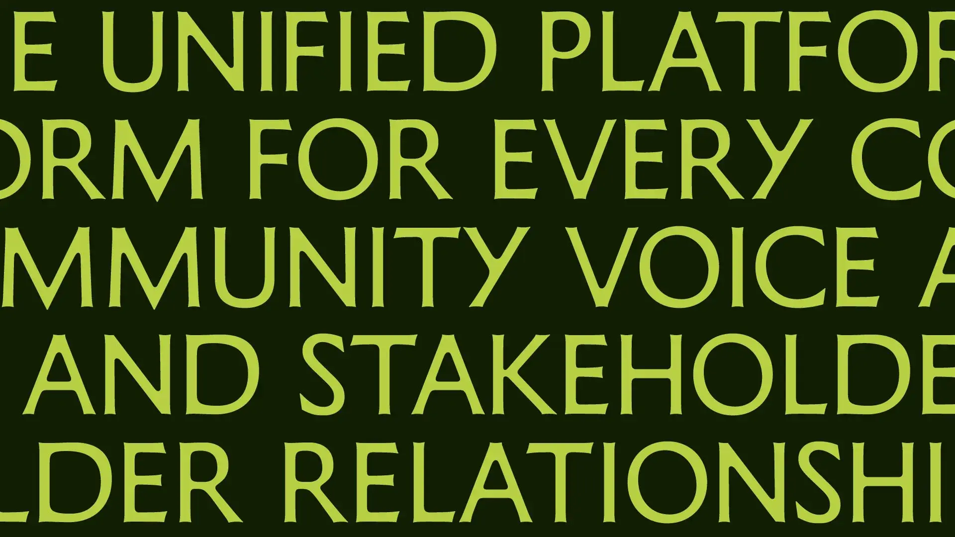
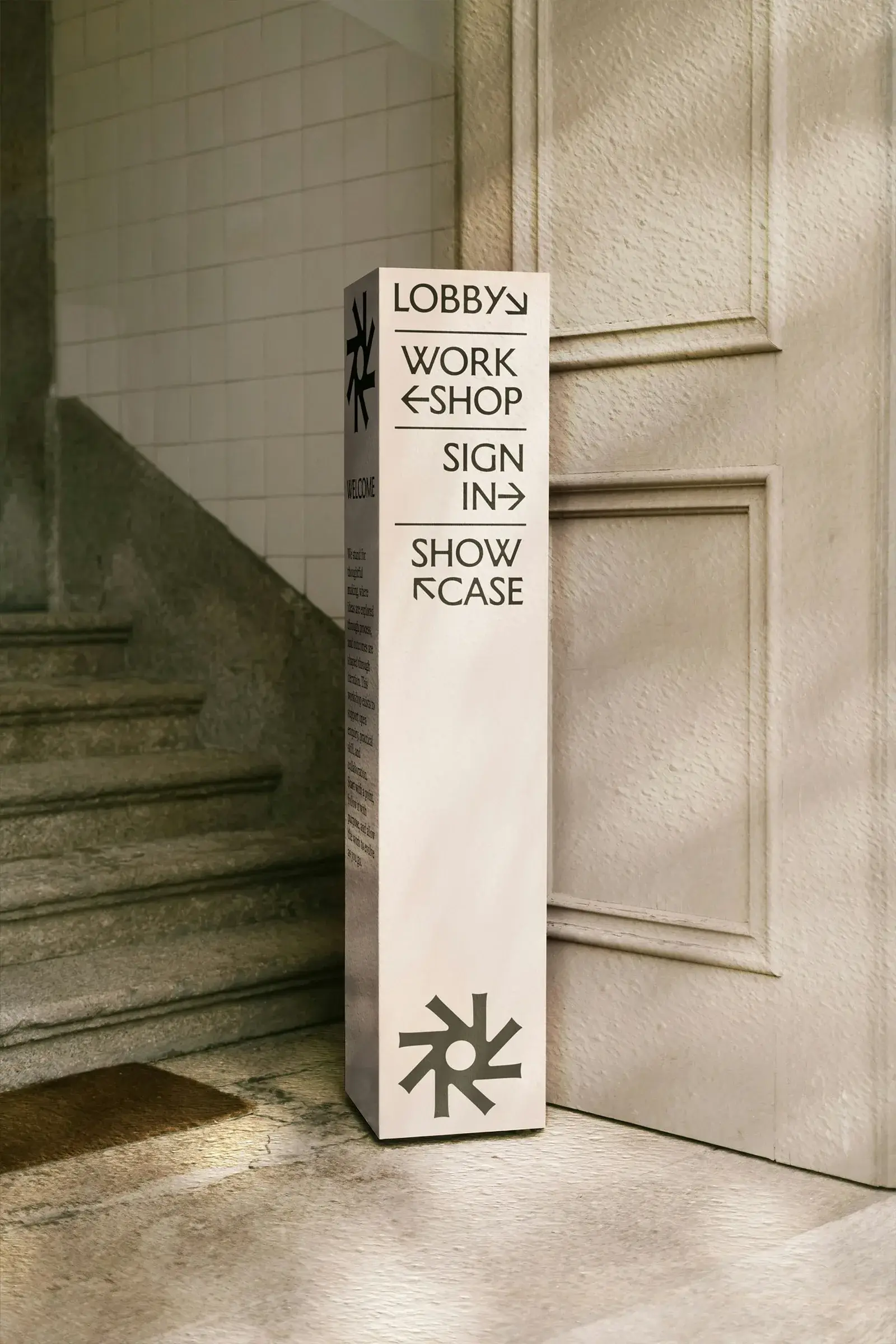
The delivered system leans into that heritage. Design Week describes high-contrast capitals with sharp angular terminals and distinctive crossbars on E, F, W and A.3 Writing on BP&O, critic Emily Gosling reads two typographic voices in the system: Memoir, from Cologne's Studio Daniel Gremme, carrying the sculpted part, and ABC Social, from Berlin foundry Dinamo, for the more contemporary surfaces.4
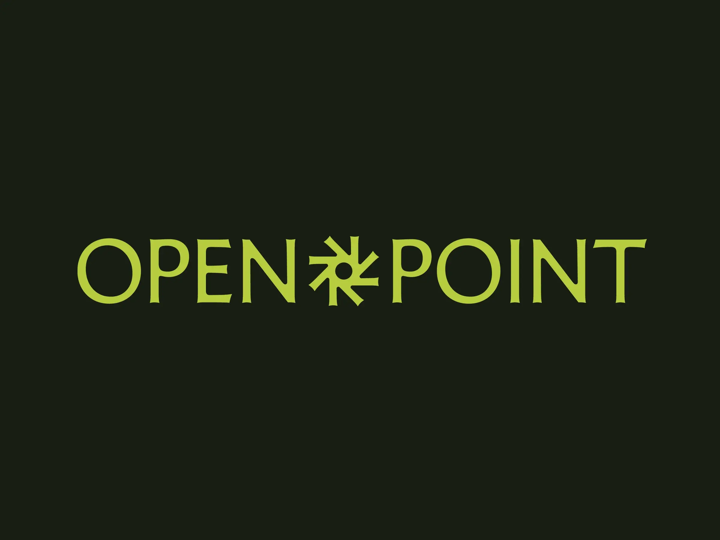
She also flags what everyone will notice first: deep greens, smart neutrals and a run of purples, a palette she compares to recent museum identities rather than to any SaaS dashboard. And she raises an intriguing resemblance: Open Point's round, six-spike symbol looks a lot like the icon Dinamo uses on its own site to display the weights of ABC Social. That remains her observation, never confirmed by the studio.4
Add a 3D cog whose rotation follows slightly off-kilter principles, described as oddly hypnotic, and you get a complete identity, from launch films down to product UI.4
A colder read
BP&O concludes that this identity "shouldn't work for a tech product, and yet it does", because the software is about human lives rather than servers.4 The analysis can go one degree colder.
The identity mostly works for the buyer, not for the consulted. The organisation deploying Open Point is buying defensibility; the lapidary vocabulary whispers that its decisions deserve marble. The resident mainly sees a well-dressed form. Nothing in the available sources establishes that a better-drawn identity increases participation, and nobody claims otherwise.
One paradox remains, and the chisel choice makes it visible: a chisel carves what has already been decided, while a consultation deals in what hasn't. By borrowing its codes from stone, Open Point quietly admits what its software is for: turning opinions into durable records.