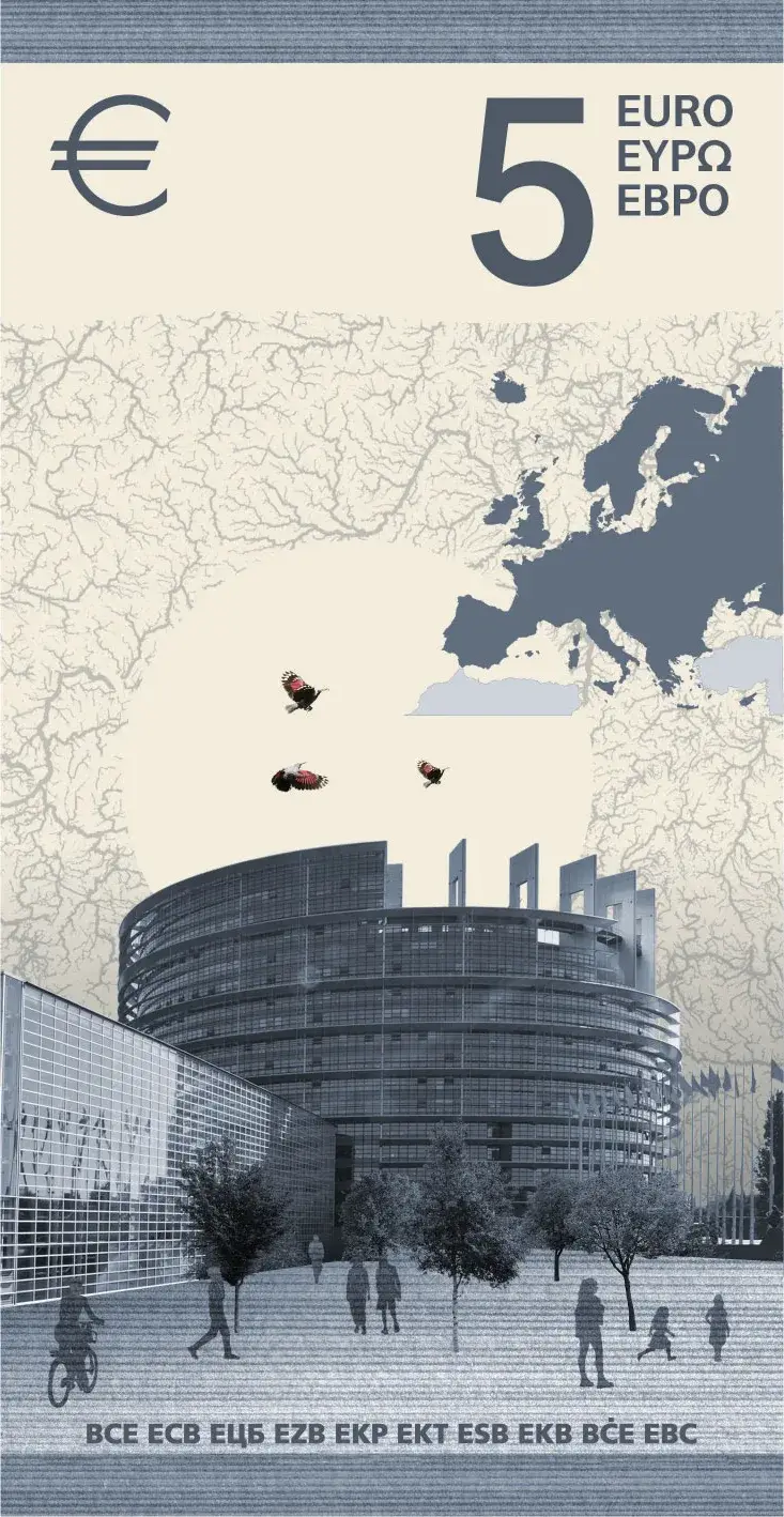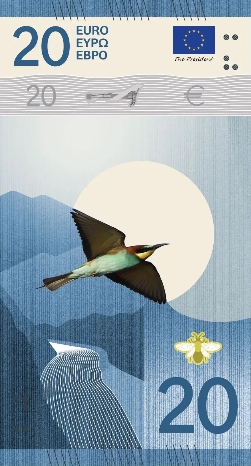
On a banknote, you expect to find a number, a signature, a watermark and perhaps some vaguely solemn architecture.
A shrimp is less obvious.
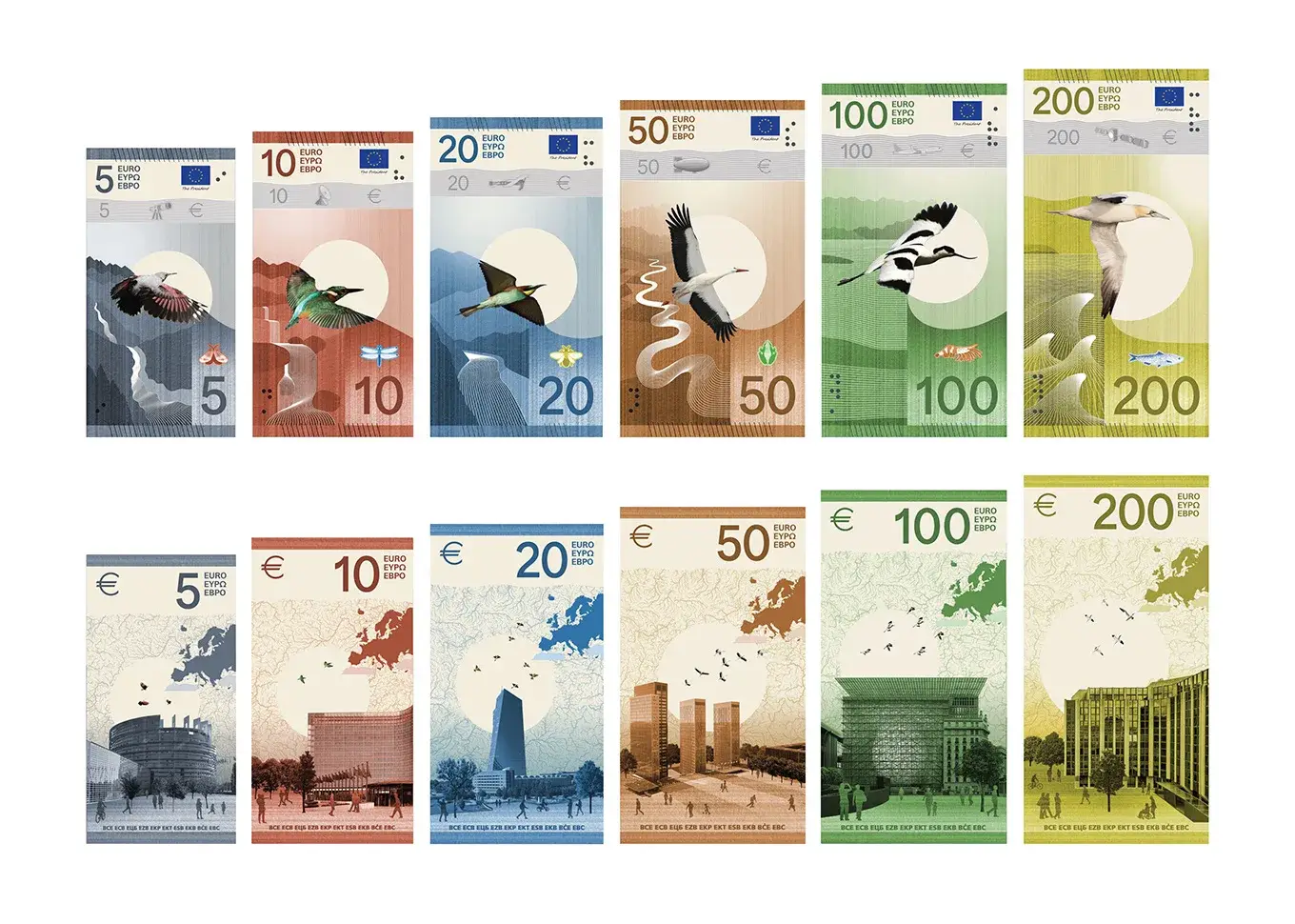

Yet in Isabelle Daëron’s proposal for the next generation of euro banknotes, small animals are used inside areas intended for security effects. The logic comes from food chains. A dragonfly can accompany the kingfisher. A shrimp can become prey for another bird. A zone that could have remained a technical rectangle becomes part of the story told by the note.1
In an interview about the making of the proposal, one detail ends up with an unusually good name: the security shrimp.
It is a tiny detail. It is also a good way into Daëron’s work.
She does not treat a banknote like a poster where a bird, a number and the European Central Bank logo need to be squeezed in before the deadline. She tries to make the constraints speak the same language: river, flight, institutions, observation technologies, species, anti-counterfeiting devices, touch and transparency.
The result is Design I, one of ten proposals shortlisted by the ECB for its future banknote series.2 In the interview, Daëron describes it as the only French proposal still in the running.1
But the most interesting part may not be that a French designer could end up shaping money used across Europe.
It is that she has been working with water since 2009.
She spent roughly fifteen years finding ways to make invisible flows visible before an ECB competition literally asked her to put rivers on money.
The tree fountain
In 2009, Daëron completed her degree at ENSCI-Les Ateliers with Topique-eau, a public fountain supplied by rainwater.7
The project begins with an unglamorous infrastructure problem. In cities such as Paris, rainwater is often sent into networks that also carry wastewater. It gets transported and treated even when some of it might be collected and used close to where it falls.
Daëron proposed an autonomous fountain attached to an existing tree or lamppost. It captures water, stores it, filters it and makes it available. Instead of hiding the plumbing inside a smooth shell, the object makes the journey of the resource legible.7
That project became the beginning of a larger family called Topiques.
She later developed bottom-filling watering cans, cooling devices using non-drinking water and objects built around wind and light. In a 2018 interview, she explains that filling the watering cans from below helped signal that the water was not potable. The form of the object teaches something about the network supplying it.8
Design here is a way to make infrastructure understandable.
That is remarkably close to the problem of a banknote.
A banknote is extremely familiar and mostly mysterious. People recognize the colour, the large denomination and perhaps a hologram. Behind the surface sit engraving, inks, relief, optical effects, a watermark, accessibility decisions and a whole visual grammar intended to say quickly: this is worth 20 euros, and it is probably genuine.
Daëron has spent her career drawing objects that reveal hidden systems. The ECB handed her a particularly nervous hidden system to visualize: trust.
1,241 to ten
The redesign did not begin as an open moodboard competition.
The ECB had already spent years consulting the public and expert groups before choosing two themes: “European culture” and “Rivers and birds.”4
The design contest opened in July 2025. The first phase did not require banknotes at all. Applicants had to demonstrate education, experience and a body of work. Daëron describes submitting references, publications, awards, exhibitions and completed projects in France and abroad.1
The ECB received 1,241 applications.3
Twenty-five designers moved into the design phase. Seventeen could work on both themes, six on “Rivers and birds” only and two on “European culture” only.3
From November 2025 the exercise became much more specific. The selected designers received a detailed brief and had to build a coherent series for six denominations: €5, €10, €20, €50, €100 and €200.3
By the 24 April 2026 deadline, 39 complete proposals had been submitted: 23 for rivers and birds, 16 for culture.3
The jury then selected ten, five for each theme.
So Design I did not win a beauty contest between ten studios. It passed through a funnel that began with more than a thousand applications.
There is another useful detail: the design submissions were pseudonymised. An independent provider stripped away the designers’ identities before the work went to the jury. Neither the ECB nor jurors could link a proposal to its author during evaluation.3
At that stage, nationality, reputation or a persuasive biography could not rescue a weak note.
Rivers, inevitably
For a designer who has worked on water since her graduation project, the theme selection does not contain much suspense.
Daëron says “Rivers and birds” was one of the reasons she applied.1
This is more than visual continuity.
She founded Studio Idaë in 2018, building a multidisciplinary practice around natural flows such as water, air and light, with drawing and narrative at its centre.6 In 2022 she began Water Calling with curator Yoshiko Nagai, a research project on Kyoto’s groundwater. It became a book, map, exhibitions and lectures. In 2026 she continued that work at Villa Kujoyama and during a micro-residency aboard the schooner Tara.910
Same year, very different scales: Kyoto’s water table on one side, European currency on the other.
The connection is not as strange as it looks.
Both projects ask how to represent systems that connect places while ignoring visible boundaries. A river crosses regions. Groundwater runs beneath streets. A €20 note can leave Grenoble, pay for lunch in Turin, sit in a till in Ljubljana and move on without anyone applying for a visa for its kingfisher.
The ECB describes “Rivers and birds” in similar terms: rivers and birds cross borders and can symbolize freedom, unity and a shared connection to nature.4
Daëron entered the competition with a material she already knew unusually well: flow as narrative.
Six months, one rectangle
Daëron describes roughly six months of work between receiving the brief in November and delivering in April.1
Studio Idaë kept running during that period. She mentions the agency handling somewhere between fifteen and twenty other projects at the same time.1
The team around the proposal included Pauline Avrillon, Elena, Julie and Nina. Studio Idaë’s own site notes that Avrillon has worked with Daëron since 2016, before the studio was formally founded.6
The banknotes began with research.
History of money. Banknotes from other countries. Ways of representing animals. Technical constraints. Layout tests. Drawings of waterfalls, sources and river stages. Daëron singles out Costa Rican banknotes as one reference that stayed with her for their treatment of animals.1
Then the work became subtraction.
Early sketches contained more explicit landscapes. Across many iterations, the team simplified them into a system of lines. The final design combines two interwoven patterns, one drawn by hand with felt-tip pen and the other vector-based. The bird’s flight reveals the landscape around it.12
The hand-drawn part is not decorative roughness sprinkled onto an otherwise digital composition. It is structural. The ECB’s own description of Design I explicitly calls out the combination of hand-drawn felt-tip and vector patterns.2
The tools are almost aggressively ordinary: drawing, Illustrator, Photoshop, printed tests, more drawing, more tests.1
Generative AI was allowed under conditions, Daëron says. Her team did not use it.1
To design an object that may need to look credible for years, they used the astonishingly futuristic method of drawing something, printing it, looking at it and doing it again.
Assigned birds
The studio did not have complete freedom.
For each denomination, the organisers had already defined a bird and a stage of the river. Reference photographs of the species were also supplied to the teams.1
Daëron says the studio considered redrawing the birds. It eventually chose to work from the supplied photographs so the species would remain immediately recognizable, knowing that later engraving and production work would transform the result anyway.1
That constraint says quite a lot about the project. A banknote is not a free-form wildlife illustration. A kingfisher still needs to read as a kingfisher after graphic choices, security processes, printing and a few years of being folded into pockets.
Another small detail: the competition does not ask for a €500 design. The proposed series stops at €200, with six denominations specified by the ECB.3
Creativity begins after a surprisingly long list of decisions has already been made. Which, to be fair, is what most real design work looks like.
The vertical banknote
Design I immediately stands out for its vertical orientation.
The reasoning is less rebellious than practical.
Daëron points out that banknotes are conventionally composed horizontally even though people often handle them upright: taking them from a wallet, sorting them or passing them from hand to hand along the short edge.1
The team did not lock the orientation at the first sketch. For a while they developed horizontal and vertical versions in parallel. Vertical eventually supported the sense of movement, openness and dynamism they were trying to build.1
During the interview someone inevitably asks whether smartphones are responsible. Maybe twenty years of vertical scrolling have prepared us for TikTok money.
Daëron says she had not thought about that.1
Probably for the best.
A “swipe up” euro would age badly.
Landscape in flight
The “Rivers and birds” brief already establishes a progression. Across denominations, the series moves through stages of a river from its source toward the sea, paired with birds and with an EU institution on the reverse.3
Daëron’s job was to stop that checklist from looking like a checklist.
In Design I the bird is not simply pasted in front of scenery. The two patterns distort around it and generate water, terrain and movement.2
The circulation continues on the reverse. The small vein-like lines discussed in the interview are a map of European waterways.1
Then another layer deliberately stops the series from becoming a natural-history plate.
Daëron includes references to technologies used to observe and map the world: telescope, radar, aircraft and satellite.1
That is more interesting than a clean split between “nature” and “technology.”
A contemporary river is measured, photographed, mapped and watched from space. Migrating birds are observed through binoculars and through data networks. The Europe of landscapes and the Europe of instruments are part of the same system.
The middle circle
A pale circular area cuts through the public mock-ups.
In the interview, the possibility of using it as a transparent link between both sides comes up. Daëron confirms the intention: connect front and back, let the bird continue into the sky around the institution, and use the materiality of the future banknote rather than treating each side as an independent poster.1
This is where looking at the proposals as web images becomes misleading.
Today we see ten JPEG-like designs. A final banknote will be a printed and secured physical object. The chosen design will still need technical development by the ECB around engraving, security features, optical effects, manufacturing and testing.14
The ECB is explicit that the images in the public survey are design proposals, not final future banknotes.2
The public is choosing a visual architecture that must survive the much harder stage where a picture becomes money.
The security shrimp
This may be the most enjoyable part of the design.
Modern banknotes contain elements whose primary job is to make copying difficult and verification fast: changing optical zones, relief, watermarks and features revealed under particular viewing conditions.5
The competition brief required designers to account for security areas and their visual principles, while the exact technical implementation would later belong to the ECB.1
Daëron could have treated those areas as a graphic tax.
Rectangle here. Shiny shape there. Done.
Instead, she folded them into the ecosystem.
Optically variable elements become small creatures from the birds’ food webs. A dragonfly relates to the kingfisher. A shrimp relates to another species. When the light or ink effect changes, the security device is also a fragment of the environment represented on the note.1
Security becomes narrative.
Even the most regulated parts keep speaking the same visual language as the rest of the object.
That is a transferable design trick: when a mandatory constraint arrives, you can hide it, endure it or ask whether it can reinforce the central idea.
Daëron chose the third option and accidentally gave Europe an anti-counterfeiting shrimp.
Naiads beneath the surface
There is another layer of Design I that the public mock-ups barely show.
The team’s watermark concept uses the Naiads, water nymphs from Greek mythology associated with springs, rivers and other freshwater. Daëron says the studio developed figures corresponding to different stages of the river.1
It adds history without putting a famous historical person at the centre of the note.
The competing “European culture” theme does exactly that with figures such as Beethoven, Marie Curie, Cervantes and Leonardo da Vinci. “Rivers and birds” can keep the main surface non-personal while hiding historical references in subtler layers.
A watermark is a good place for such an idea.
It exists without being constantly visible. You have to move the object, hold it to the light and discover a second reading.
Mythology literally sits below the surface.
Colour meets ink
A display lets a designer push colour until it almost emits light.
A banknote eventually has to be printed.
Daëron says her background in print production pushed the team to slightly desaturate the proposed colours. Extremely saturated screen colours can disappoint once printed, so they designed with the material translation in mind.1
This sounds obvious until you remember how the project is currently being consumed.
The public is judging the designs on screens. The object may eventually be handled under supermarket lighting, folded in a pocket, fed through machines, inspected by someone with impaired vision and checked by a shopkeeper in seconds.
The Retina rendering is the easiest part of its life.
The €25,000 gamble
Money eventually becomes a question when the object being designed is money.
The jury report gives the compensation structure. Each of the 25 Phase 2 designers received €5,000 per theme. Submitting a complete proposal brought another €10,000 per theme. A proposal selected by the jury brought a further €10,000.3
In the interview, Daëron describes the first two amounts more as contest compensation than as a fee capable of financing the studio’s actual workload.1
That distinction matters.
Six months of research, several people, many versions and all the ordinary client work happening in parallel do not suddenly become a lucrative commission because the invoice has five digits.
Design competitions live in a peculiar economic zone. Some work is paid, some risk is accepted because the project allows a studio to explore something rare, build a new kind of reference or, if everything goes unusually well, design an object used by an entire continent.
Daëron puts it simply: working on a currency may be a once-in-a-lifetime opportunity.1
For Studio Idaë, the banknotes are simultaneously a commission, a competition, a research project and an investment.
Bridges escape the banknote
Choosing what to print on a shared European currency is an old political problem wearing graphic-design clothes.
The current banknotes dodged the issue in an almost comic way. Their bridges, windows and gateways represent architectural periods, but the actual monuments were invented. No real French cathedral, Italian bridge or German station had to be selected over everyone else’s.
Then the Dutch ruined this elegant neutrality.
Starting in 2011, designer Robin Stam helped bring those fictional euro bridges into the real world in Spijkenisse, near Rotterdam.11
Architecture had been invented so it belonged to nobody. Then somebody built it.
Money copied imaginary architecture, and architecture copied money back.
It is hard to find a better reminder that a banknote never remains a flat image.
It moves between people, becomes familiar, turns into a symbol and may eventually become municipal infrastructure because humans have time and local development budgets.
Beyond prettier money
The ECB is not doing all this because the current notes have started to resemble a banking website from 2002.
Central banks regularly upgrade banknotes to make counterfeiting harder. The ECB also wants the next series to improve sustainability, accessibility, inclusiveness and how strongly people can relate to it.45
Graphic design is one layer in a much larger renewal.
The Governing Council is expected to choose the final visual design around the end of 2026, taking the contest and public preferences into account. The ECB then expects several more years of development and production before new notes reach people’s pockets.4
That matters when looking at the images circulating now.
Even if Design I won tomorrow, nobody would wake up next Monday with a vertical €20 and a kingfisher in a wallet.
Between a visual proposal and billions of reliable physical objects lies a slightly obscene amount of engineering.
Not nature money
The obvious danger of “Rivers and birds” is that it could become six attractive ecological postcards.
Cute bird. Blue water. Some reeds. Europe saved by turquoise gradient.
Design I instead keeps returning to circulation.
The bird moves. Water moves. Patterns cross. Observation technologies appear. Institutions connect to territory. Security devices become pieces of a food web. Naiads hide in the watermark. Front and back try to talk to each other.12
That coherence probably exists because water is not a theme Daëron added to her portfolio for this competition.
She has spent years asking a closely related question: how do you give form to something that moves around us without being immediately visible?
In Topique-eau, it was rain and the hydraulic network.7
In Water Calling, it is Kyoto’s groundwater.9
In her urban work, it can be non-potable water, wind or light.610
In the banknotes, it becomes rivers, migration, money itself and, more abstractly, trust moving between strangers.
A euro may be her most literal flow project yet.
Into public hands
For months, the banknote was a problem internal to Studio Idaë.
Is the waterfall too illustrative? Are the patterns fighting? Does vertical really work? Where does the denomination sit? Is the bird recognizable fast enough? How can technology appear without breaking the landscape? Does the object feel stable enough to be trusted with value?
Then on 23 July 2026 the ECB revealed the ten finalists and opened its public survey, which runs until 21 September.4
The design became something else.
Millions of people can now look at money that does not exist yet and decide whether it looks like money.
That may be the strangest stage of the job.
A designer can explain months of research, the two line systems, the mythological watermark, waterways and print tests. A voter may simply see a nice bird. Someone else may hate the vertical format. Someone else may prefer Beethoven. Another person may vote for the shrimp without even knowing it is there.
Currency design has that brutal requirement: it must work in two seconds and still have enough depth to survive twenty years of looking.
Daëron says in the interview that money needs stability and trust. That pushed the team toward an aesthetic she describes as calmer and more reassuring than some of their other experiments.1
“Trust” can sound abstract until the note returns to an ordinary scene.
A stranger hands you a printed piece of material. You accept it. You give them something worth €20. Nobody signs a contract. Nobody calls Frankfurt. The object works because you recognize it, because it looks right, because its technical signs are hard enough to imitate, and because millions of other strangers will accept the same object after you.
That is the job.
Fit all of that into one rectangle.
And, if possible, still leave room for the shrimp.