This morning Radim Malinic asked a deliberately irritating question in Creative Review: why have design books become so boring? He points to the same classics returning again and again, from Interaction of Color to The Art of Looking Sideways, and argues that publishing about design has moved less than the disciplines it documents.1
The intuition is attractive, but it bundles together two different complaints: the books supposedly look alike, and publishers supposedly keep making the same bets.
IRZ started with the easier part to test, the physical objects.
Twelve books
We assembled a small corpus of 12 titles, three each from TASCHEN, Phaidon, Thames & Hudson and Lars Müller Publishers.581114 This is neither a random sample nor a comprehensive market study: the books were selected from current, new or prominently listed design titles in publisher catalogues checked on August 20, 2026.
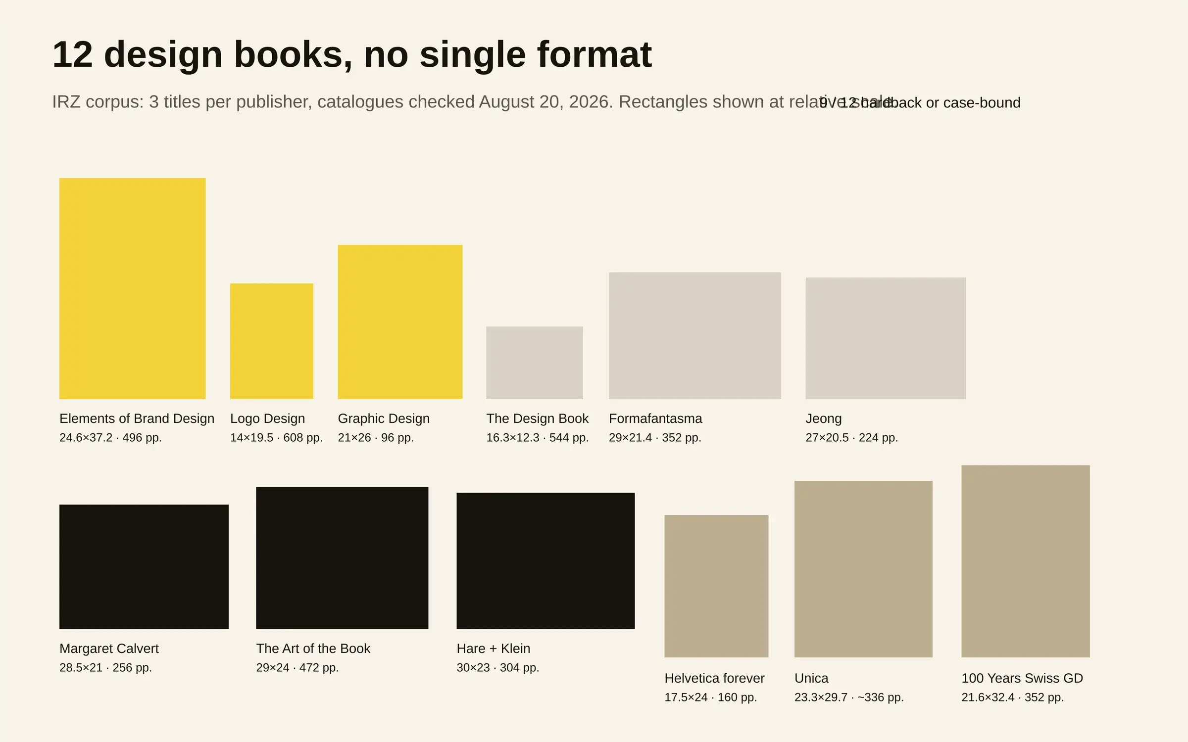
For this small test, one question matters: can the claim of one physical template survive contact with the measurements? The answer from these twelve objects is no.
The smallest object in our selection, Phaidon’s The Design Book, measures 16.3 × 12.3 cm while containing 544 pages.8 At the other end, TASCHEN’s The Elements of Brand Design reaches 24.6 × 37.2 cm, weighs 3.78 kg and runs to 496 pages.5
The cover-area ratio between those two formats is 4.56, while page counts run from 96 to 608 with a median of 344; TASCHEN’s Graphic Design. 1890–Today supplies the 96-page minimum.7 Shape changes just as visibly, from the 28.5 × 21 cm landscape-like proportions of Margaret Calvert: Woman at Work11 to the compact 14 × 19.5 cm Logo Design. Global Brands.6
Visual trends can still exist, naturally, but reducing this selection to “the same book again” already requires ignoring a great deal of material difference.
Nine hardbacks
One convergence does appear quickly elsewhere: nine of the twelve books are hardback or case-bound. The exceptions in our selection are Formafantasma, Jeong and the new edition of Helvetica forever, all paperbacks.91014
Our mini-corpus is too small to turn 75% into an industry statistic. Phaidon’s complete Design category provides a stronger clue, however: at the time of our check its format filter listed 97 hardbacks among 111 titles, against 14 paperbacks.4
The most visible uniformity may therefore have less to do with a cover grid than with the material status of the book.
A design volume has to carry large images, tolerate repeated consultation and, most importantly, retain enough presence to justify physical ownership alongside Behance, Instagram, Are.na, digital archives and studio portfolios.
“Coffee-table book” is not merely an insult; in this market it also describes a product position, one where physical presence is part of the value being sold.
Proof object
AIGA was already asking in 2016 why so many graphic designers write books. Malinic explained that he wanted to open his process and show how he had reached his current work; the article also observed the book’s practical role as public journal, demonstration of expertise and promotional object.2
That role has not disappeared, because a design book can simultaneously operate as manual, portfolio, archive, manifesto, studio calling card and object signalling something about its owner’s taste.
Stack enough functions together and conventions appear naturally. There must be enough imagery to reward browsing, enough text to defend the book as more than a catalogue, and production good enough to embody the competence being discussed.
That explains familiarity rather better than a theory in which every art director secretly selected the same InDesign template.
Canon returns
Malinic’s second complaint survives our check much better: familiar subjects keep returning.
Lars Müller’s “Graphic Design Books” page for the 2026 semester prominently includes 100 Years of Swiss Graphic Design, Ruder Typography Ruder Philosophy, Helmut Schmid Typography, Wolfgang Weingart’s Typography and Karl Gerstner’s Designing Programmes.1617
The new Helvetica forever edition is dated 2026.14 Univers + Helvetica ≠ Unica, also announced for 2026, reconstructs the story of a typeface created in the mid-1970s.15
To be sure, these are not bad subjects; the economic advantage is precisely that they arrive with a reason to exist on the shelf already attached. Helvetica, Swiss graphic design and established historical figures bring an audience, teaching history, available archives and a narrative of legitimacy that can be understood immediately.
A publisher is not financing an idea alone. It is paying for rights, image reproduction, possible translation, colour work, paper, printing, binding, storage, freight and returns. The more ambitious the physical object becomes, the more attractive a subject with legible demand can look.
Risk costs
Leonardo de Vasconcelos exposed another consequence of this economy through Judging by the Cover. Studying ten major design-book publishers, he found very weak representation of Black authors and contributors. Speaking to Creative Review, he connected some of publishing’s conservatism to market pressure; Adrian Shaughnessy added that making money is punishingly difficult even with established figures.3
The point extends beyond diversity, since a sector built around specialised audiences, expensive imagery and heavy physical products can turn repetition into a form of risk reduction.
The repeatable unit might be an author, an established movement, the “definitive monograph”, a reference manual or a lavish retrospective. Booksellers, press teams, teachers and buyers know immediately what those categories are for.
By the time layout begins, part of the predictability may therefore have been fixed by the publishing decision itself.
Same promise
A few examples make the supposed template look especially weak.
TASCHEN can turn branding into a 3.78 kg XL object with The Elements of Brand Design, then compress thousands of logos into a 14 × 19.5 cm volume.56 Phaidon sells both the tiny Design Book and much wider contemporary titles: Formafantasma at 29 × 21.4 cm and Jeong at 27 × 20.5 cm.8910
Thames & Hudson uses printed laminated case binding without a jacket for the Margaret Calvert monograph and for its own 472-page publishing history, while Hare + Klein Design is a conventional hardback.111213
The objects are plainly different. Their common feature is a promise of permanence: the selection has been considered, printed and documented carefully enough that a reader might still want to own it after closing the browser tab.
In a discipline producing thousands of free images every day, that promise makes sense. It also mechanically favours material that already resembles a reference work.
Leave the shelf
If design books need shaking up, merely changing their covers would be an unusually ironic response.
The meaningful shift can happen earlier: publish a corpus that has not already acquired its own pantheon, hand the narrative to people who do not appear in ten existing university bibliographies, accept a provisional book instead of a “definitive survey”, make a light edition intended to be annotated and worn out rather than displayed, or treat the publication as a dated version of research that can continue evolving.
Distribution can change too. Malinic chose self-publishing for Book of Ideas, writing, designing and producing the project rather than waiting for a conventional publishing offer.2 That moves risk onto the author while returning decisions that the economics of a larger publisher may otherwise standardise.
The “boring” design book is therefore not necessarily a failure of designers; it may be the rational product of a market asking an expensive object to do three things at once: teach, prove taste and remain saleable for years.
The twelve books we measured do not resemble one another as much as the complaint suggests. They are mostly trying to convince the same buyer that they deserve permanent physical space on a shelf.