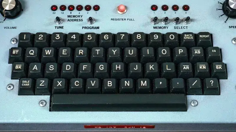
You know this font. You have seen it on intercoms, elevator panels, keyboard keycaps, and industrial nameplates. It has a slightly goofy Q, a top-flattened 3, and a 7 with a distinctive downward hook. Most typographers cannot name it. Most makers do not realize it was designed for the machines they are now building.
The font is called Gorton. It was designed in 1894 for pantograph engraving machines, not for print or screens. 1 Every stroke is the same thickness because the router cutter could not easily vary width. Every ending is rounded because sharp corners slowed the tracing stylus. 1 The italic is merely slanted. The condensed version is simply narrower. This is not a font designed to be admired. It was designed to be cut quickly into metal, plastic, or wood, then survive decades of wear.

From lens engravings to Apollo
The story begins not in Wisconsin but in Leicester, England. Taylor, Taylor & Hobson made precision lenses and needed to mark them. 1 Their solution was a pantograph engraver: a physical template of a letter, traced by hand, with a linked cutter reproducing the movement at a different scale. The font that came with it was monoline, geometric, and deliberately simple.
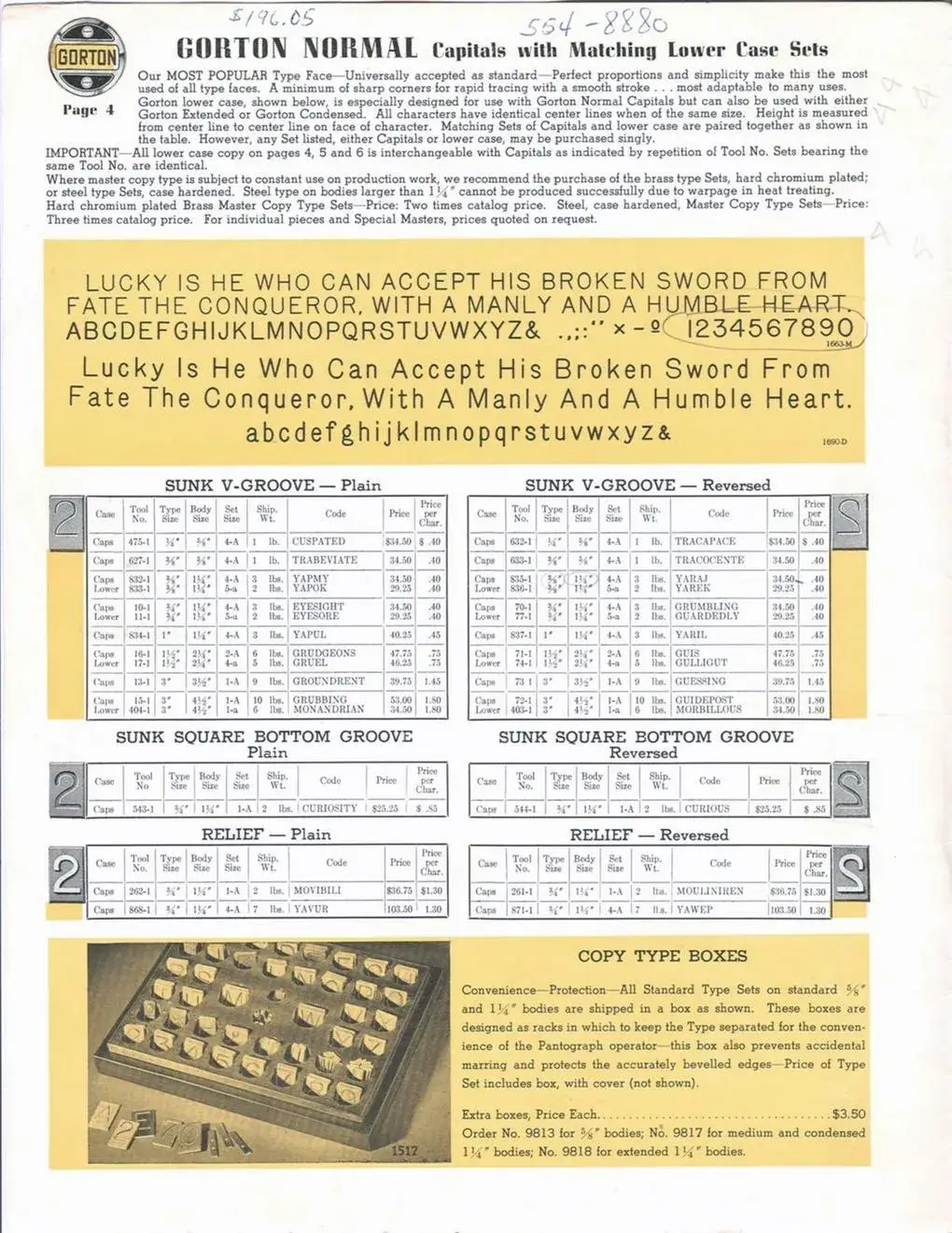
In 1898, George Gorton Machine Co. licensed the system for the United States. 2 The font traveled with it, unnamed at first—just the default alphabet that came with the engraver. When other fonts were added to the catalog, it was retroactively called Gorton Normal. By the 1952 Gorton Master Copy Type catalog, it was described as the company's most popular face, chosen because its few sharp corners allowed "rapid tracing with a smooth movement of the pantograph stylus." 3
The font's military career is documented. The Department of Defense specification MIL-M-18012B, issued in July 1964, lists Gorton Extended, Gorton Normal, and Gorton Condensed as acceptable commercial fonts for engraved lettering on aircraft control panels. 4 NASA's 1969 Databook for Human Factors Engineers references Gorton styles for aerospace equipment. 5 The Apollo Guidance Computer's Display and Keyboard—the DSKY interface astronauts actually used—carried Gorton Condensed and Gorton Normal on its engineering drawings. 6
You have seen Gorton on F-14 Tomcat cockpit panels, Kennedy Space Center elevators marked EARTH and SPACE, Nike nuclear defense control panels, and Palisades nuclear plant controls. 1 It appeared on British cars, motorcycles, and 3,775 finger posts in a UK national park. It was on the Mercury Friendship 7 capsule. It was on typewriter keys, teletype terminals, and early computer keyboards not because designers chose it, but because the engraving shops that made the keys used the tools and templates they already had.
The nonexistent font
Marcin Wichary, a designer at Figma, started noticing Gorton in 2017 while researching keyboard fonts. By 2024 he had walked more than 100 miles in Manhattan photographing it. His essay "The hardest working font in Manhattan" is the first comprehensive history of the letterform. 1
Wichary documents how Gorton spread far beyond engraving. Keuffel & Esser grabbed the shapes for Leroy lettering sets. Wood-Regan Instrument made Wrico. Both were simplified pantographs: no scaling, no carving, just a pen tracing a template. EC Comics and All-Star Comics used Leroy in the 1940s and 1950s, most notably in the first comic to introduce Wonder Woman. Stencil makers, Letraset, and plotter manufacturers all riffed on the same monoline forms.
The font's anonymity is part of its success. Because it was the default, it rarely got a name. Because it was cut into metal rather than printed, it could not easily become a digital font file. When digital revivals appeared, they carried different names: Leroy, Gothic, Block, Engineering Standard, Universal, Linetica. The shapes persisted even when the brand did not.
Back to the router
Laser engravers, pen plotters, and affordable CNC routers have made pantograph-style routing accessible again. But most makers reach for Helvetica, DIN, or whatever font came with their machine. Gorton was designed for exactly this use case. Its monoline construction means it scales cleanly. Its lack of sharp corners means it cuts quickly. Its constant stroke width means you can change weight simply by changing cutter size—the same logic that made it work on 19th-century brass templates still applies.
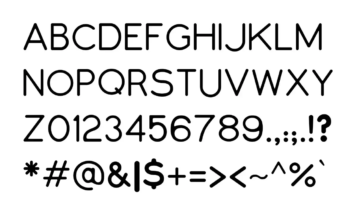
Open-source revivals are already here. GortonDigital by drdnar revives Gorton Normal with careful geometric reconstruction, producing template splines that can be stroked to any weight. 7 Open Gorton by Dakota Felder is based on Signature Plastics' Gorton Modified and released under an MIT license for the keycap community. 8 Milling Cad Simplex by Tanguy Vanlaeys adds OpenType alternates specifically for CNC milling workflows. 9
These are not nostalgia projects. They are practical tools. The GitHub issues and discussion threads show people using them for actual parts: control panels, nameplates, keyboard keycaps, and machine labels. The font's constraints—once a limitation of physical templates—have become a design feature for digital fabrication.

The honest font
Wichary argues that Gorton's appeal is its honesty. It shows up, does the job, and does not ask to be admired. The routing imperfections, the mismatched lowercase, the kerning mistakes on weathered NYC intercoms—these do not feel like abuses of typography. They feel like the font being used as intended: to solve a problem and walk away.
That is a strange thing to say about a typeface. But Gorton was never really a typeface. It was a set of brass templates for a machine that traced letters by hand. The digital versions are translations of a translation, and something gets lost in the process. The weathered Gorton carved into mid-century steel, filled with paste or wax, worn by decades of finger presses—that texture cannot be reproduced in a TTF file.
The modern revivals are useful precisely because they acknowledge this. They do not try to perfect Gorton. They try to make it available again, with all its quirks, for the machines that inspired it. If you are engraving aluminum, milling acrylic, or plotting a keyboard plate, you now have access to a font that was designed for exactly that gesture.
You just have to know where to look for it.