Creative Boom’s headline is irresistible: when Brompton needed a refreshed identity, Studio Blackburn went straight to the factory floor.2 The image practically writes itself, with designers collecting metal offcuts, opening Illustrator and letting the production line finish the brand system for them.
The reality is more useful because the studio did go into the factory, found a colour there and made an unusually physical part of the launch on site; yet once each component is traced back to its source, most of the identity turns out to have a different origin, leaving a system that resembles the bicycle itself, with several parts doing distinct jobs before they lock together.
The shortcut
The refresh was unveiled for Brompton’s 50th anniversary in 2025,3 at a moment when recognition was hardly the problem: the existing logo and triptych symbol already carried substantial equity, so Studio Blackburn deliberately left both alone.1
What had broken was the system around them: as Brompton grew across Europe and Asia, its identity became fragmented and too clinical to scale coherently through retail, online, dealers, CRM, advertising and social channels.1 The studio therefore needed to build infrastructure around a sign that already worked, and the factory story becomes much more informative once those new elements are separated by origin instead of being compressed into a single neat myth.
Direct blue
Of all the new elements, Brompton Blue has the cleanest provenance: Studio Blackburn says the signature colour was inspired by a factory visit flooded with clean industrial blues, after which it became the visual anchor linking digital controls, physical assets and retail signage, with room for custom palettes around selected collaborations.1
The causal chain needs no creative gymnastics: place observed → colour noticed → brand colour, making blue the element that most literally deserves the “found on the factory floor” story.
The colour choice also works because the factory is part of the company’s everyday operation, not scenery assembled for a campaign. Brompton says more than 300 engineers, designers and makers work across West London and its specialist welding division in Sheffield; steel frames are hand-brazed, brazers receive 18 months of in-house training, and a small signature beneath each frame identifies its maker.4 Some factory machinery is designed in-house as well, with parts named after the people who created them,4 so the manufacturing culture contains enough specific detail to support a visual language without inventing industrial folklore for the photo shoot.
The gesture
The motion system has a different lineage. Studio Blackburn starts with the bike itself, specifically the quick mechanical “final flick” of the rear wheel as a Brompton finishes unfolding, and uses that repeated action as the seed of a motion architecture that Creative Review also describes as central across digital, film and retail.13 From there the studio extends the mechanical metaphor into gears, moving from smooth “3-speed” UI transitions to more energetic, layered “12-speed” editorial layouts,1 so product behaviour becomes an animation rule instead of a decorative quotation from industrial equipment.
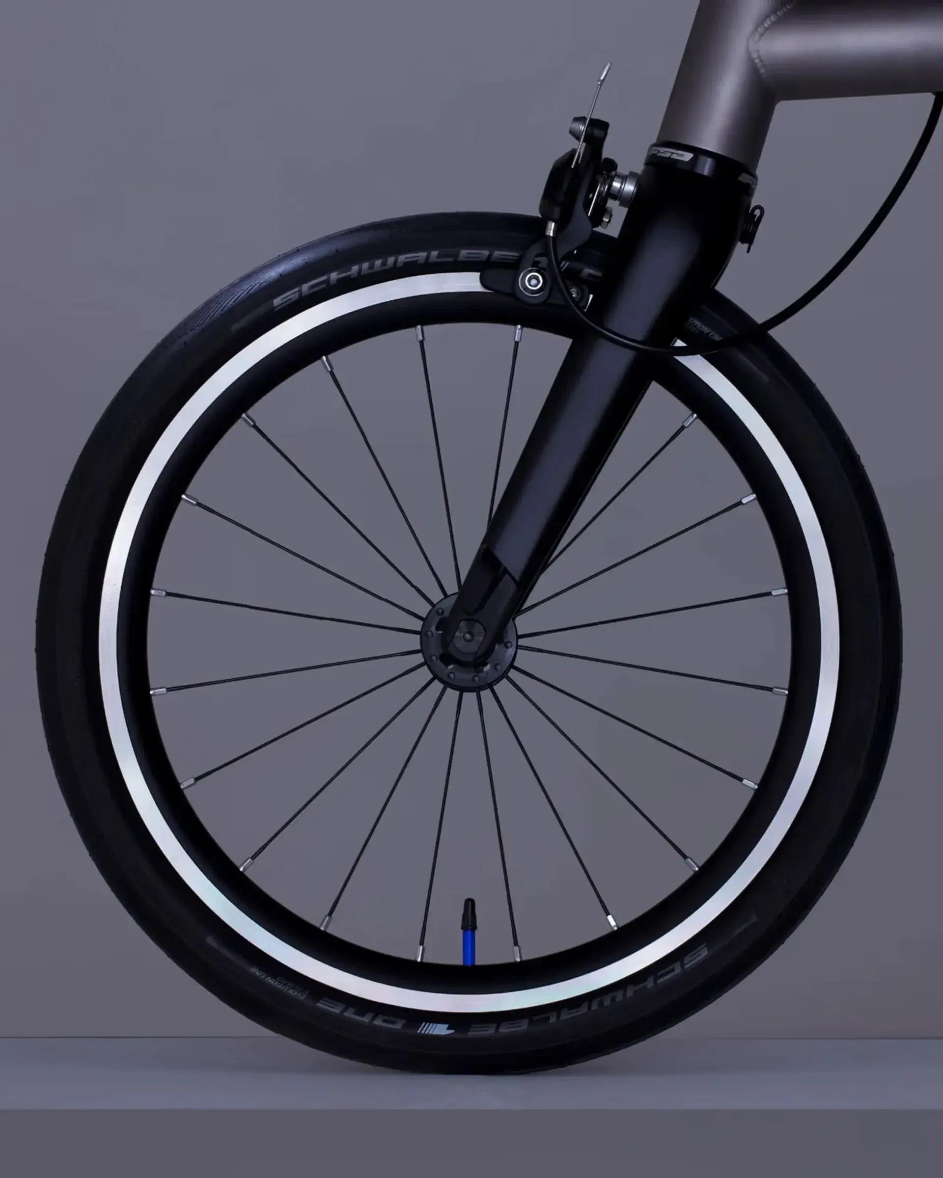
That distinction suggests a useful method for other projects, because a workshop visit does not have to end with borrowed hazard stripes or workshop colours; sometimes the stronger source is the irreducible gesture of the object itself. Folding supplies that signature in Brompton’s case: the company still describes the transformation from full bicycle to compact package as taking under 20 seconds,5 and even G Line, developed through eight years of testing and iteration, is summarised with a revealing distinction that everything is new except the fold.6
The grid
The graphic framework follows the same product logic. Studio Blackburn describes its primary visual asset as a modular system derived from the geometric volume of the folded Brompton box logo, expanding outward so that content and journeys appear to unfold across a motion grid.1 By contrast with ordinary industrial mimicry, the system does not need to draw a hinge or copy a steel tube; it abstracts the change of state itself, from compact form to expanded one, and turns that transformation into page behaviour.
The type
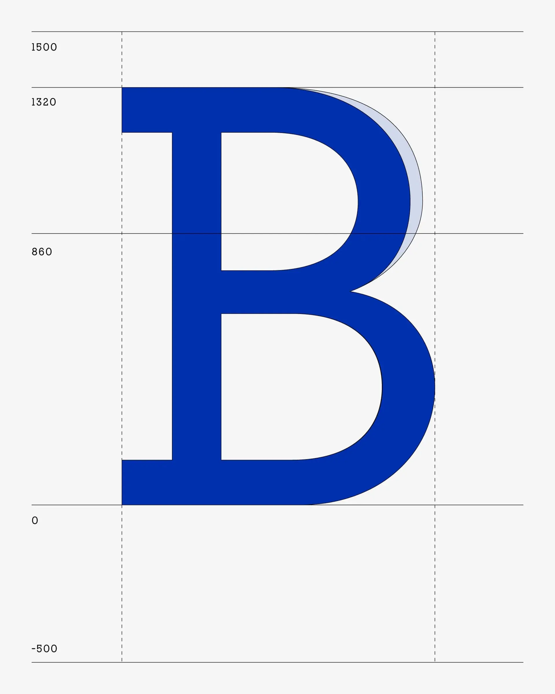
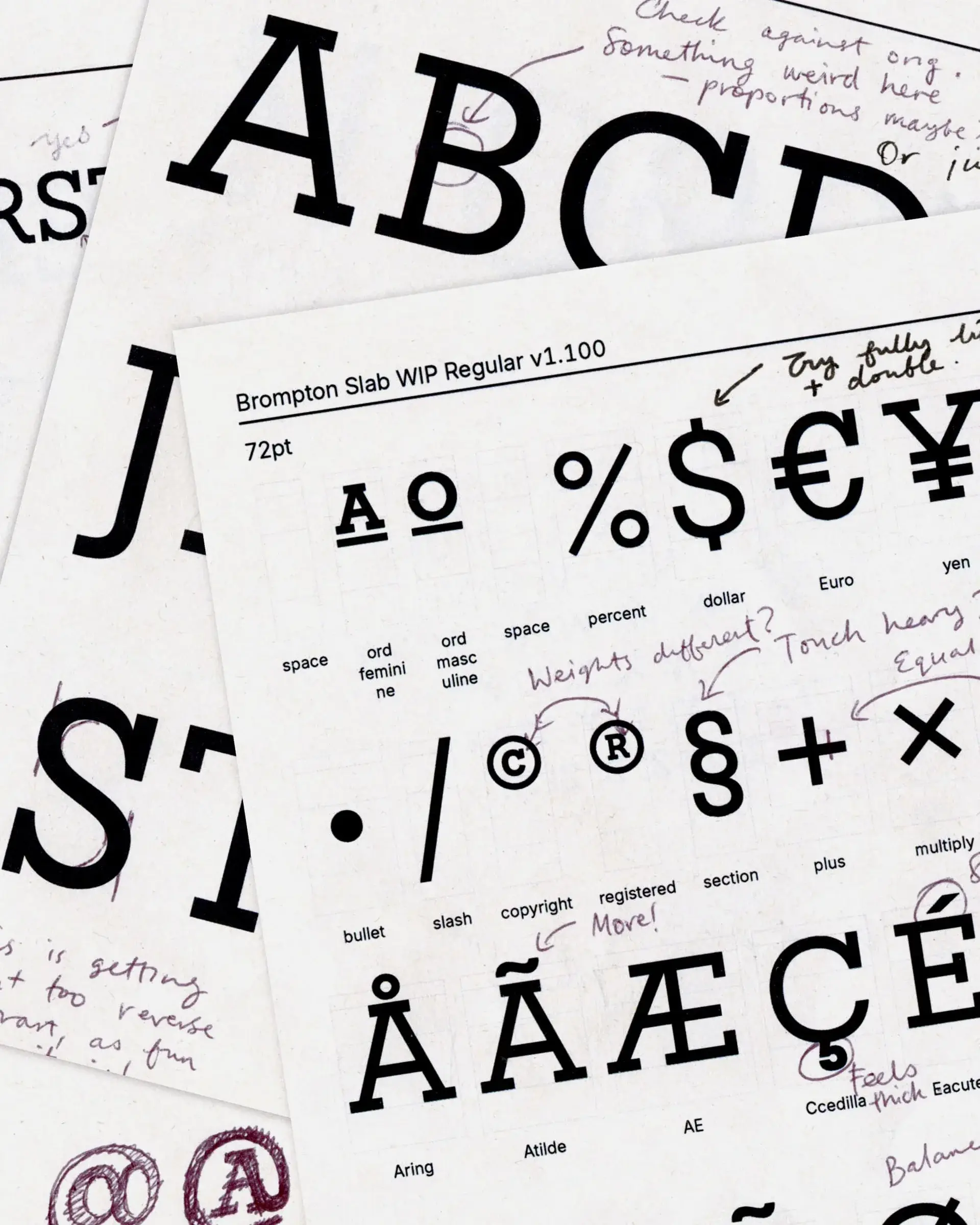
The typeface tells a different story again. The historical Brompton logotype had never been developed into a complete alphabet, leaving international teams without the punctuation and characters needed for consistent language across markets.1 Studio Blackburn, working with type designer Sam White according to Creative Boom, expanded the geometry of those existing letters into a full display typeface,2 even adjusting the “O” so the enlarged character set remained legible in longer text.1 Its documented source is therefore the historical logotype.
Creative Boom elegantly compresses the lineage by saying that the typeface came from the logo and the logo came from the factory,2 although Studio Blackburn only documents the first half of that chain. Its primary case study does not say that the historical logo itself was extracted from factory lettering, machinery or a manufacturing gesture, which makes Brompton Slab easier to understand as brand continuity rooted in an existing sign, rather than vernacular lettering discovered on a workshop wall.
The shoot
The factory returns at the launch stage in an extremely physical way, when the teams cut oversized metal letters on site and photographed them among the machines and gestures used to make the bikes.12
That distinction is stronger than the original shortcut: nobody needs to pretend a hidden typeface was discovered beside a brazing station, because a system born from graphic heritage can instead be passed through the material language of the company. In the photographs, the test is whether those letters can sit among metal, fixtures and hand-made marks while still looking native to the place rather than imported from an unrelated moodboard.
The strategy
Finally, Life Unfolded belongs to the strategic layer. Studio Blackburn connects the platform to Andrew Ritchie’s older idea of the bicycle as a “magic carpet for the city”, then to the transformation made possible when a compact object becomes a way of exploring the city;1 the phrase acts as the glue joining visual system, motion and tone, while “Welcome to the Fold” turns the same mechanical idea into membership of a community.1 This layer is brand narrative, fed by product and company history rather than an observation made on the factory floor.
What it proves
“Brompton found its new identity on the production line” remains a very good headline, but it compresses several different causal paths into one. Of the seven elements we traced, only blue has a direct and explicit factory origin; motion and the graphic grid come mainly from the product, the typeface from graphic heritage, the metal letters turn the factory into a place of materialisation, and strategy plus voice grow from folding, city life and community.
The visit did not deliver a complete brand kit; what it supplied was more useful, a coherence test against a place where the brand’s manufacturing claims are visible every day.
Brompton has a manufacturing culture visible enough to stop industrial metaphors from becoming abstract decoration. A company where frames carry the brazer’s signature and some machines carry the names of their makers can bring handwriting, metal and industrial blue into its identity without inventing the craft narrative afterwards.4
A method
The lesson travels beyond Brompton.
“Go to the source” is only useful once the designer decides what kind of evidence the source can actually provide. A site visit may offer a colour, a sound, a constraint, a vocabulary or nothing visually useful at all, and the work begins when direct observation is kept distinct from conclusions drawn later from product, history and strategy. Studio Blackburn’s system benefits from that separation: blue can come from the building while the typeface comes from the logotype, motion can follow the bicycle while the strategic line describes urban transformation, and the launch can return to the factory to test those layers against real manufacturing. The factory floor is therefore one contributor among several, which is stronger than an origin myth because the identity can return there and still look truthful.