Redesigning an old interface often looks like a paint job until the first load-bearing wall moves.
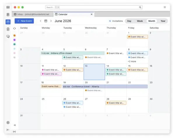
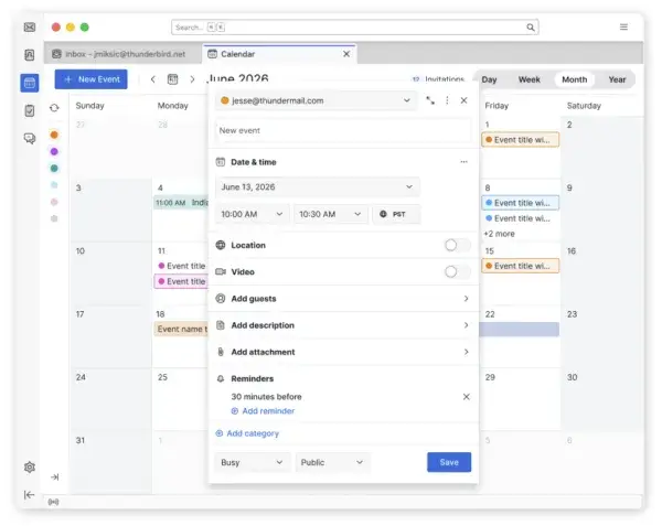
Thunderbird’s calendar has accumulated functionality for years. The design team now describes it as powerful, but visually dated and functionally convoluted.1 The first response was not to replace the whole screen. Work began on isolated elements, including the event-details window.
That choice was practical. The dialog was self-contained enough to redesign and test without rebuilding the entire calendar codebase.1 The problem appeared later. Improving pieces independently also created differences between them. New visual and functional decisions did not yet form one system. Thunderbird’s own account says isolated redesigns were starting to create inconsistency and debt for both design and development.1
From piece to system
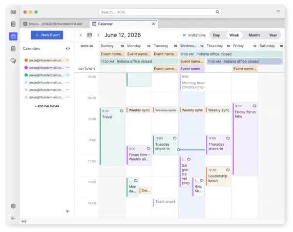
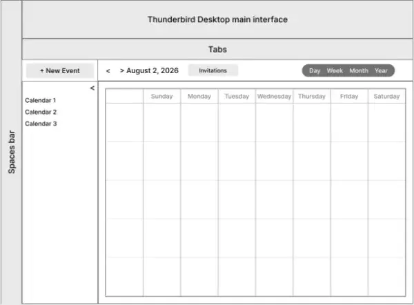
The team stepped back to three plain questions: what should the grid look like across day, week, month and year views, how should people move through time, and how should multiple calendars and data sources be managed?1
The resulting structure has three main areas. The calendar grid remains the central workspace. Navigation sits above it. A sidebar handles calendars and data sources.1 The sidebar can collapse because the same person may need very different amounts of calendar-management UI on a narrow laptop and a large desktop screen.
The interesting part is not the three-region layout itself. It is the point where the team stops treating screens as a pile of independent tickets. A local improvement can be easy to ship while several local improvements together make the product harder to understand.
Thunderbird had already faced that tension during its Supernova redesign. In 2022 it previewed a new calendar direction intended to modernize an old interface without throwing away the depth long-time users expected.4 This is not an instant before-and-after. It is a slow migration in which every new component has to coexist with workflows people have used for years.
Users, not approvers
Thunderbird’s separate 2026 research on desktop settings shows a similar method. The team interviewed users about how they find and understand options, then used those findings to shape priorities rather than simply asking whether a new screen looked nicer.2
For the calendar, Thunderbird published proposals, ran a survey and collected feedback about the capabilities users consider important: task integration, platform interoperability, agenda, mini-month and multi-week views.1 Those requests do not automatically become features. They show where simplification could accidentally remove a workflow that matters.
This is a clean example of a recurring problem in creative software: interface debt is not made only of old pixels. It also contains habits, shortcuts, exceptions and working paths whose value is invisible in a screenshot.
Thunderbird’s 2026 roadmap places calendar work inside a larger effort that also touches settings, search, accessibility and overall product coherence.3 The calendar is not an isolated skin. It has to join a shared language that is itself still changing.
Not finished yet
The August 10 post describes a design direction and what Thunderbird expects to deliver next. It does not claim every mock-up is already part of the stable release.1 The team plans a gradual rollout followed by more usability testing and feedback.
That makes the process more useful to watch. Thunderbird did not “solve calendar” with one large design file. It chose pieces that were easier to isolate, discovered that local victories could create a new form of inconsistency, then moved up one level and redesigned the structure.
It is less dramatic than a clean redesign reveal, but much closer to how mature tools actually change: fix a piece, watch where the debt moves, then decide whether the next problem still lives in the piece or in the system around it.