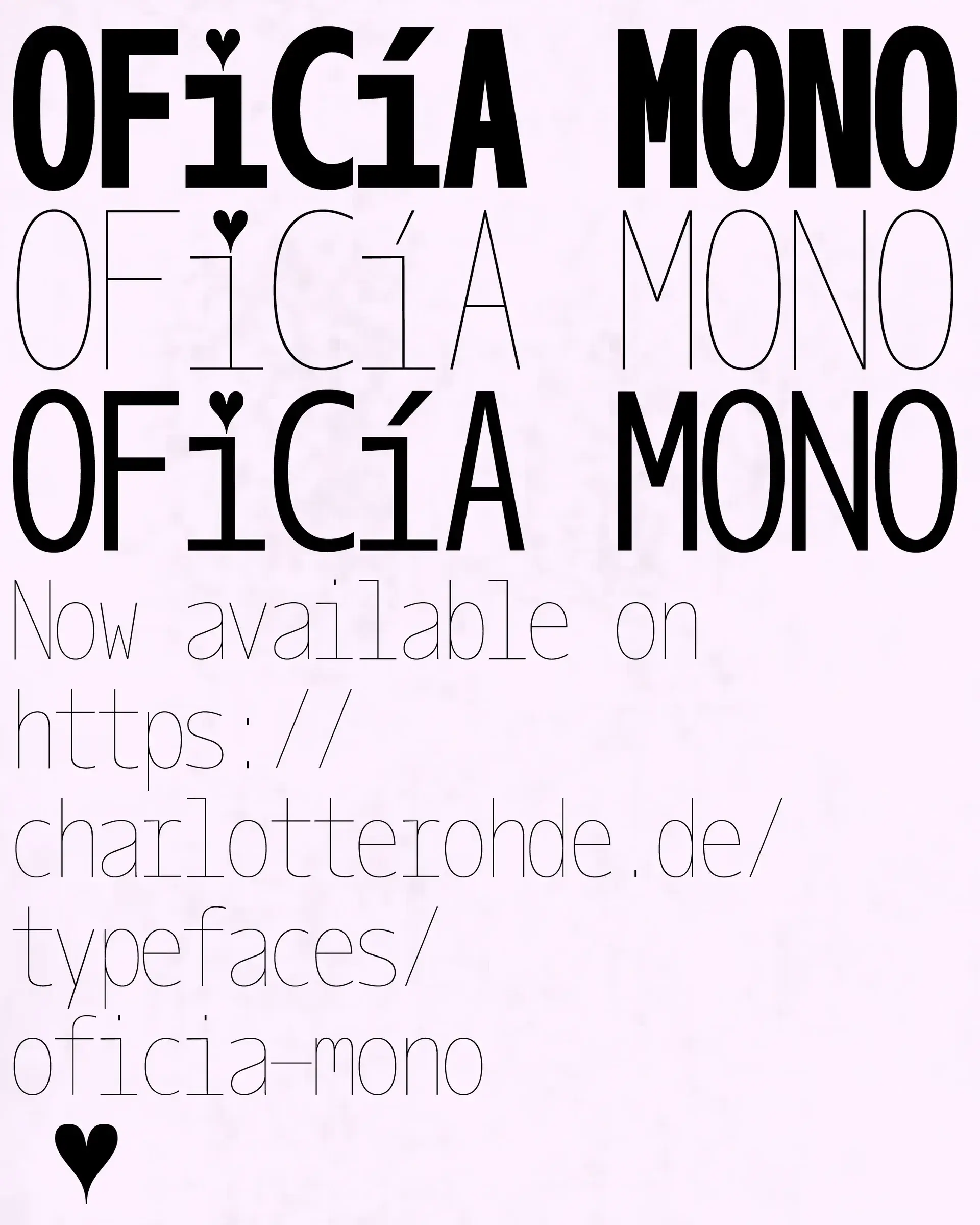
The tiny heart above an i is the detail in Oficía Mono that photographs best. Charlotte Rohde has built much more around it: the typeface behaves like a fictional office worker, fascinated by finance, performance reviews and professional codes, while the official specimen calls her a girl who is “invested,” letting the financial and personal meanings overlap.1
That character could easily swallow the whole story. In August 2026, however, Rohde described a second ambition for Oficía: she wanted to provide an alternative to Gill Sans, the famous face associated with Eric Gill, whose sexual abuse of his daughters was documented in his own archives and by biographer Fiona MacCarthy.7 Rohde frames her response as occupying comparable typographic ground with work drawn from her position as a woman.3
The letters carry that intention, but the more durable mechanism appears after the drawing is finished, when somebody has to acquire the font. Rohde’s catalogue sets prices, discounts and licensing terms that decide how easily different people can put those files to work.
Heart at work
Oficía Mono began with a commercial job rather than a complete political programme. Rohde says an early version appeared during a Mercedes campaign in 2022, when she converted an existing grotesque into a monospaced character, developed a light weight and eventually filed the experiment away; she returned to it later and expanded the idea into the family now on sale.3
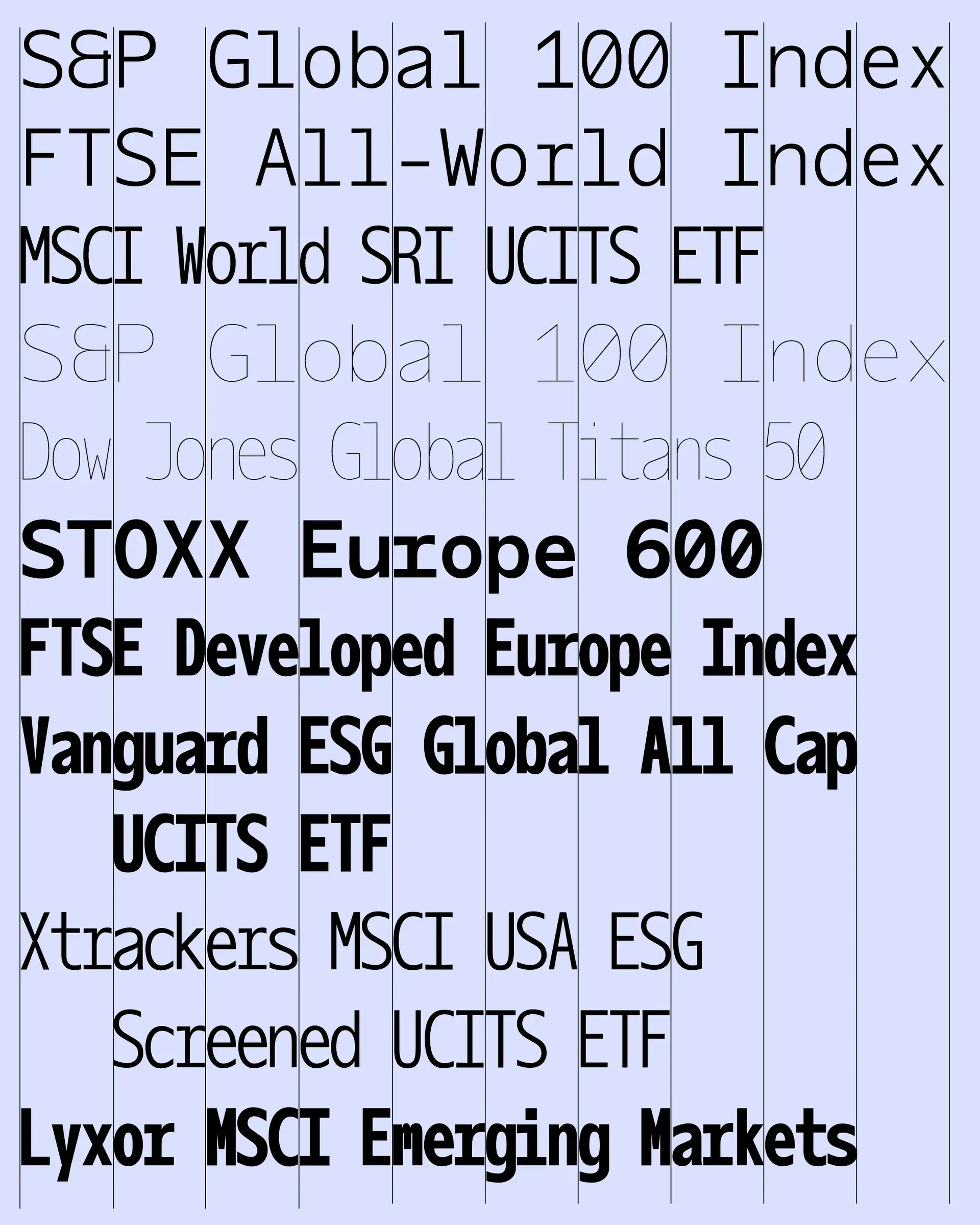
Eight styles are listed in the current catalogue, ranging from Hairline to Bold and including compressed cuts.1 Monospace regularity, tables, numbers and the language of assessment give the specimens their office atmosphere, while little departures keep the system from feeling bureaucratically neat: the glyph set contains a heart, and stylistic alternatives alter letters including i and j as well as several diacritics.1
The promotional work extends the joke into a fictional career. Rohde made invented performance reviews for Charlotte Rohde™, then used them in an installation and live-printing performance in which the employee persona became part of the specimen itself.3
The character later escaped the specimen altogether. In the financial science-fiction novel developed around the project, Oficía Greif becomes a hedge-fund manager who speculates on the value of words, turning a typeface conceived for the office into somebody who works inside an imagined market for language.3
Replace, not erase
Antique Olive and Gill Sans are among the references Rohde names around Oficía.3 Gill Sans brings a complication that a purely formal moodboard would miss: the face remains embedded in British graphic history, while what is known about Eric Gill makes an uncomplicated heritage tribute untenable.
Rohde’s claim is deliberately about making an alternative, rather than pretending that a new font can make Gill Sans or its history vanish. She wants Oficía to answer comparable graphic needs with a different authorship and point of view.3 For a studio that likes the softness, grotesque construction and expressive weight associated with that territory, another usable file now exists beside a design created nearly a century ago.
The intervention stays modest. Gill Sans remains in archives, computers and old identities; Oficía simply gives a designer another file to reach for today.
The invoice matters
Rohde’s catalogue adds a less visible layer to the project. Her shop currently advertises 90% off for students and 50% off for cultural or political projects, with those discounts arranged by email.2 The offer covers her typeface catalogue rather than being a special rule written only for Oficía Mono, and the published FAQ describes a commercial licensing system rather than an ideological test for buyers.
Pricing depends on the size and type of the organisation using the font. The client is normally supposed to hold the license, while a designer who purchases a font for one client cannot simply carry that purchase into unrelated commissions.2 None of this prevents a company with politics Rohde dislikes from licensing the typeface; what changes is the cost of access for categories of work she has chosen to support.
That distinction moves the politics away from symbolism and into the mundane machinery of distribution. Digital type travels through files, budgets, contracts, studios and clients, so a discount can alter who finds the tool affordable before a single poster has been designed.
Eight years earlier
There is an older version of the same question in Rohde’s practice. AIGA Eye on Design interviewed her in 2018 about Type Club, a platform intended to give student typefaces a life beyond school, and she described paying attention to the gender balance of the designers whose work appeared there.4
In that interview Rohde made a useful distinction between the message inside a design and the action around it. A typeface did not need to carry an explicitly feminist concept, she argued, for its designer to make a feminist decision with it; when a project with feminist intentions asked to use Calyces, she could provide the font free of charge.4 She returned to the same example while discussing Calyces with It’s Nice That the following year.5
Calyces also shows that distribution was never the only lever. ECAL cites the face in its discussion of gender-sensitive typography because Rohde drew her own gender symbol into the character set, putting a political question directly into the available signs.6
The two approaches have therefore existed side by side: draw a position into the form, and make decisions around the way the form is shared. Comparing the snapshots from 2018 and 2026 also shows a broader visible mechanism. A case-by-case free license for feminist projects now sits alongside an advertised discount for students and cultural or political work.24
Two snapshots cannot prove an uninterrupted eight-year programme, and Rohde does not present them that way. They do make one recurring concern easy to see: a type designer has some control over the conditions under which her tools enter other people’s work.
Context leaks
That control ends quickly once the file is in use. Oficía’s heart might appear in a campaign with no feminist intention, and a company can buy the face, ignore the story behind it and keep only a shape that suits a layout; meanwhile a political collective can make radical work with the most conventional typeface available.
Political meaning therefore cannot be read straight from the glyphs. Forms bring references with them, but the designer’s convictions are not embedded in a font file like metadata that survives every copy.
Pricing and distribution offer a narrower, more practical intervention. Rohde cannot decide what every future poster means, yet she can make her catalogue cheaper for selected people and projects.2 Other creative fields have equivalent levers: solidarity pricing for tools, educational access to patterns, free software licenses for non-profits, or workshop time reserved at a reduced rate for work that would otherwise struggle to happen.
These choices do not certify the politics of the finished result. They turn a stated value into a material condition somebody encounters before making the work.
How type travels
Oficía Mono is entertaining because its office worker seems to acquire a parallel life after 6pm, complete with performance reviews and speculative finance. Rohde’s more transferable idea is quieter: a typeface continues to be designed after the alphabet is finished, through its price, contract, catalogue, visibility and terms of access.
The heart above the i communicates in a second and makes an excellent image. A 50% discount has none of that visual charm, yet it operates at the moment when a graphic object becomes a tool in somebody else’s hands.2
For a designer who wants a project to carry a position, that suggests a useful test: after the statement and the symbols are removed, is there still a concrete decision left in the way the object circulates?