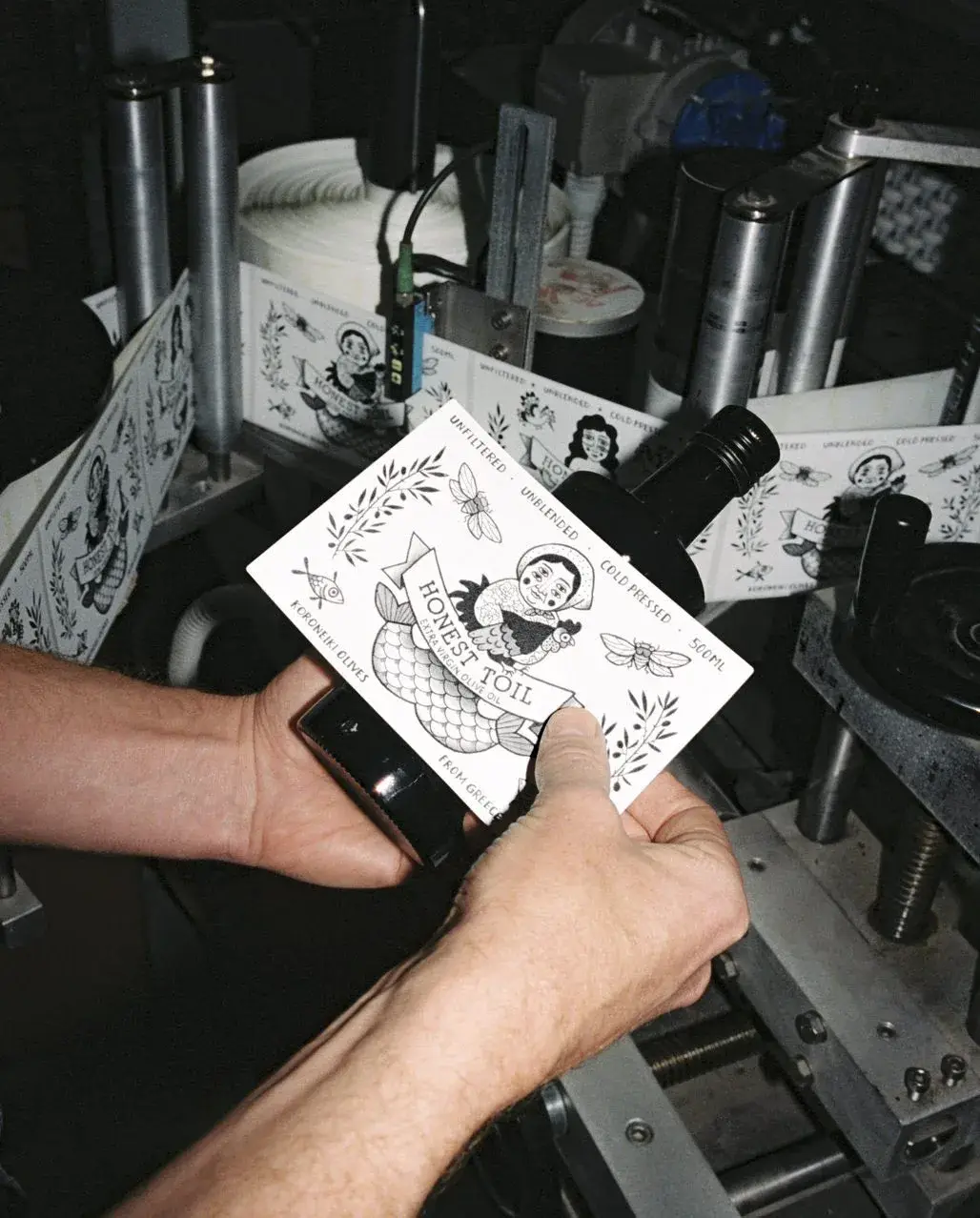
A brand that regularly changes its label is normally doing something dangerous.
Honest Toil has done it almost from the beginning.
The small olive-oil producer in the Peloponnese published a retrospective of its packaging this year. Looking across sixteen years, the team realized that almost every Honest Toil label had been designed by women artists.1
The interesting part is not the statistic. It is that constant change was never treated as a branding problem that needed fixing.
It became the continuity of the brand.
The kitchen-floor label
Honest Toil traces its visual language back to Berlin in 2010. Tom Woodgate’s roommate Tine Damgaard was making playful paper cut-outs and collages. Those experiments inspired the first label on hand-filled bottles sold at flea markets.1
There was no master brand system. It was a solution made with the people already around the project.
The same pattern continued.
Eszti designed a five-liter tin and a bag-in-box around shared meals. Enikő Eged made the cat can inspired by the local Kopanaki market. Graphic designer and tattoo artist Dóra Berczi painted mythological figures and even the bottle lettering in ink. Zena Kay worked with everyday table scenes. Ella Mittas produced a woodcut for a poster.1
These are not five applications of one template. They are five visual languages.
The collaboration rule
In an interview with Something Curated, Woodgate says experimenting with labels has always developed alongside making the oil itself.2
The founders happened to know as many artists as farmers, so changing the packaging felt more natural than locking a single identity in place.
Woodgate says he has been told that changing branding every year is “commercial suicide.” He still prefers the experiment: the labels are a fun collaboration before they are a marketing-approved strategy.2
That sentence is not evidence that visual inconsistency causes sales. Honest Toil has not published a sixteen-year controlled test of packaging systems.
What the case does show is that consistency can live somewhere else.
A rotating face
Different illustrators do not make every bottle unrecognizable because other things repeat much more strongly: the Honest Toil name, the oil, its origin, a direct tone, bottle and tin formats, and the story of a small network of growers and artists.12
Repetition does not always have to sit in a logo locked to the millimeter. It can sit in a rule: regularly invite someone new to interpret the same product.
That starts to look more like an editorial model.
A magazine changes its cover illustration without becoming a different magazine. A publisher commissions different artists across a list. Honest Toil treats a recurring bottle a little like that.
More than decoration
The examples in Honest Toil’s archive explain why the system holds together.
Enikő’s cat points back to a local farmers’ market. Dóra’s figures mix Greek mythology with plants and animals from the area. Zena’s tables are about ordinary shared food.1
Each artist has room to move, but the subject remains connected to the same world: oil, cooking, Messinia, neighbors, markets, and meals.
That is a strong enough constraint to create variety without making each package an unrelated art project.
Consistency elsewhere
A multinational that needs recognition in two seconds across fifty countries has different constraints.
Honest Toil is small. Something Curated describes Woodgate and Juli Laki as living and working close to production rather than operating a remote brand with occasional field trips.2
That makes a moving identity more credible because customers are not following only an abstract visual system. They are also following harvests, people, and collaborations.
So the lesson is not “change your logo every year.”
It is more useful: before rigidifying an identity, decide what actually needs to remain constant.
For Honest Toil, the answer was not one illustration.
It was the ability to make another one.