For decades, good industrial design has often meant making the mechanism disappear.
The enclosure closes around the object. Screws move underneath. Gears, springs, cams and blades remain inside, while the outside keeps only the surfaces touched by the hand and a few clean controls. The finished product is supposed to make its function feel natural, almost mechanical-free.
Kokuyo has turned that habit inside out.
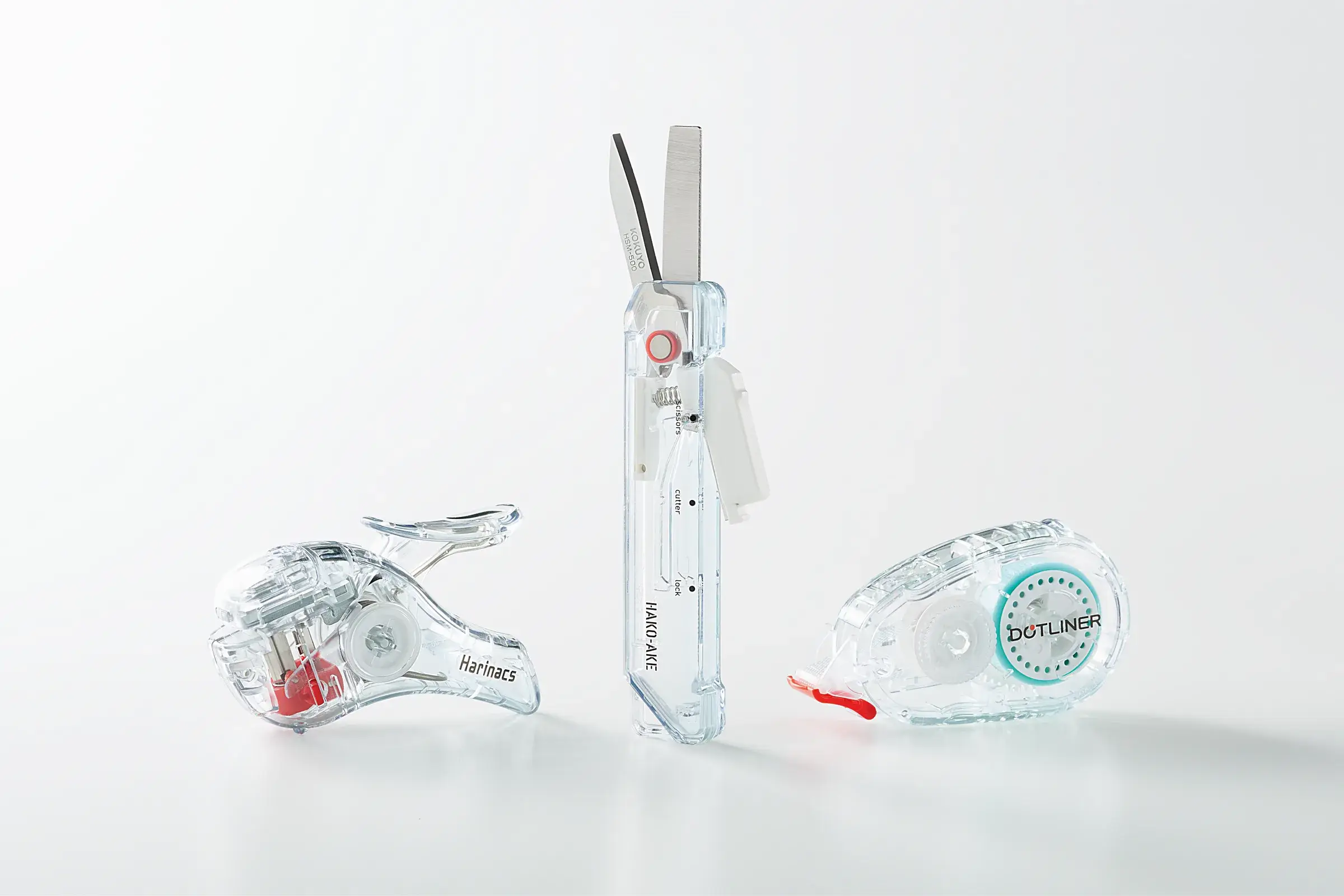
Its Transparent Mechanism series, launched in June 2026, revisits three established products, the Harinacs Compact Alpha stapleless stapler, Hakoake scissors/cutter and Dot Liner tape glue.12 The functions remain the same while their enclosures become transparent, exposing mechanisms that were already there.
That could have remained an aesthetic exercise in the long tradition of clear Game Boys and skeleton watches, but Kokuyo adds a more deliberate choice: moving parts receive accent colours so that each product's function becomes more intuitive.12 Transparency therefore does more than prove that complicated things exist inside, it becomes part of the interface.
Function looks like magic
Take the Dot Liner.
From the outside, the gesture is trivial, place the dispenser on paper, pull it and leave a strip of adhesive, while inside the tape has to advance, deposit adhesive, separate from its carrier and be collected by another reel. The transparent version lets the eye follow that entire route instead of reducing it to a single hand movement.
Kokuyo describes the collection through exactly these moments: paper being bound, blades crossing and tape being guided by gears.1
An opaque housing compresses all of those events into one piece of feedback, “it works”, whereas a transparent housing can make cause and effect visible again. The difference seems small on a stationery product, yet it touches an old design problem: how can a system explain itself without a manual?
Research by Peiyao Cheng, Ruth Mugge and Cees de Bont on transparency in product design identified several intentions among designers, including helping consumers comprehend a product, demonstrating functionality and, in some cases, improving usability.3
Showing the inside therefore need not be decorative when the mechanism itself carries useful information about what the object is doing.
Colour directs the eye
Making the whole enclosure transparent immediately creates another problem because everything becomes visible at once, and a pile of parts, pivots and springs can create more visual noise than an opaque cover if nothing tells the eye where to look. Accent colour helps solve that problem.
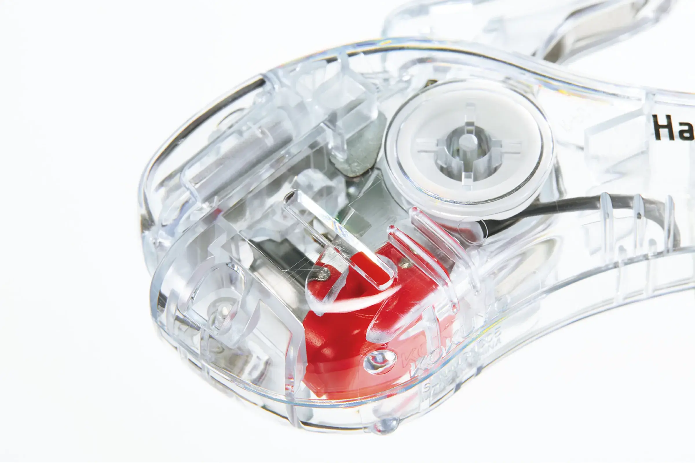
Kokuyo explicitly says that moving parts are coloured to communicate each product's function intuitively.1 That changes the status of transparency. The designer is no longer saying only “look inside”, but “look at this part, because this is where the action is”.
The logic resembles a technical diagram, where every line does not receive equal weight and an arrow, colour or section pulls attention towards the important motion or flow, Transparent Mechanism applies that hierarchy directly to the physical object.
That hierarchy also explains why Kokuyo chose three mechanical products rather than, for example, a transparent notebook, a conceptual achievement humanity had somehow managed to survive without.
Harinacs visibly transforms paper, Hakoake contains blades and a mechanism supporting two uses, and Dot Liner moves tape through several elements, so each object contains a process worth observing rather than merely an attractive collection of hidden parts.
Trust behind glass
Seeing a mechanism can also change how a product is judged.
A 2022 controlled experiment by Cheng and Mugge compared products with transparent and opaque covers among 126 participants. Transparent versions significantly improved perceived technological advancement, perceived performance quality and overall attitude towards the products.4
To be sure, transparency cannot mechanically guarantee a better component, and a clear enclosure can reveal a bad gear perfectly well. What changes is the amount of evidence available to the user. The product exposes more of its construction and may suggest that the manufacturer has less to hide, or simply make technical sophistication visible.
This form of trust is fragile: when the inside looks coherent, precise and understandable, exposing it can reinforce perceived quality, while an unnecessarily complicated, poorly finished or theatrical interior can make the same transparency work against the product.
A transparent housing is therefore also an aesthetic risk: the outer shell can no longer perform all of the visual staging by itself.
The inside becomes facade
This may be the more amusing industrial consequence.
As long as a component remains hidden, its shape can be optimised for cost, assembly, strength or moulding with relatively little concern for appearance. Once the housing becomes transparent, the same component joins the product's visual facade.
A functional lever becomes a graphic shape, which means spring colour and axis alignment suddenly matter, structural ribs become visible, and even moulding marks that an opaque shell once sent quietly into oblivion begin to participate in the aesthetic.
In other words, the designer has moved the boundary between technical part and visible part.
That constraint partly explains why transparency costs more than changing a pigment. Research on transparent product design notes that transparency can increase design and manufacturing costs.4
Transparent Mechanism also aims for a glass-like appearance by subtly tinting clear resin.12 The manufacturer now has to control both function and the optical quality of an enclosure that exposes what it previously hid.
Visible, not repairable
The limit matters because seeing the gears in a Dot Liner does not mean those gears can be replaced, and understanding the tape path does not guarantee that the enclosure opens with two screws. A clear shell provides no spare-part number, service manual or promise that components will remain available.
Actual repairability depends on other decisions: assembly method, access, spare parts, documentation, standardisation and repair cost.
Transparency acts more directly on understanding and perhaps on perceived repairability.
A visible mechanism is likely to feel less mysterious because a user may observe where something jams, which reel is empty or which part transmits force, making the object mentally less closed even when it remains physically difficult to disassemble. That distinction between understanding and actual repairability should remain explicit.
The mechanism reappears
Dot Liner makes a good example because its history shows how much work an opaque shell eventually erases.
Kokuyo says its development began in 2002 around a mundane problem: tape glue became stringy when the dispenser was lifted from the paper. The dotted adhesive pattern emerged as a way to solve that behaviour, followed by three years of development before launch in 2005.5
Two decades later, the transparent version gives visual presence back to that accumulation of technical decisions, which may be the most convincing quality of Transparent Mechanism. We use everyday objects whose behaviour has been refined across several generations and eventually begin to treat that behaviour as obvious, while a closed housing helps the design work disappear from view.
Opening the enclosure visually is a reminder that ease of use does not mean absence of mechanism, quite often, it means the mechanism has been worked on long enough that we no longer need to think about it. Sometimes showing it is enough to make us look again.