
Berlin Museum has an unusual branding problem: it does not want to find the right typeface.
It wants several, and it wants them to disagree inside the logo itself.
The former Stadtmuseum Berlin brings together multiple sites and collections spread around the city. Its public brand is becoming Berlin Museum, while the foundation's legal name remains unchanged. The institution explains the simple new name with a less simple idea: Berlin cannot be told from one building or in one voice.
Working with Stan Hema, the museum built an identity where every wordmark combines two different typefaces.
That is a notable reversal of the familiar branding instinct to compress an entire organization into one carefully coherent proprietary font.
The street archive
The museum describes its type selection like a small collection of urban fragments.
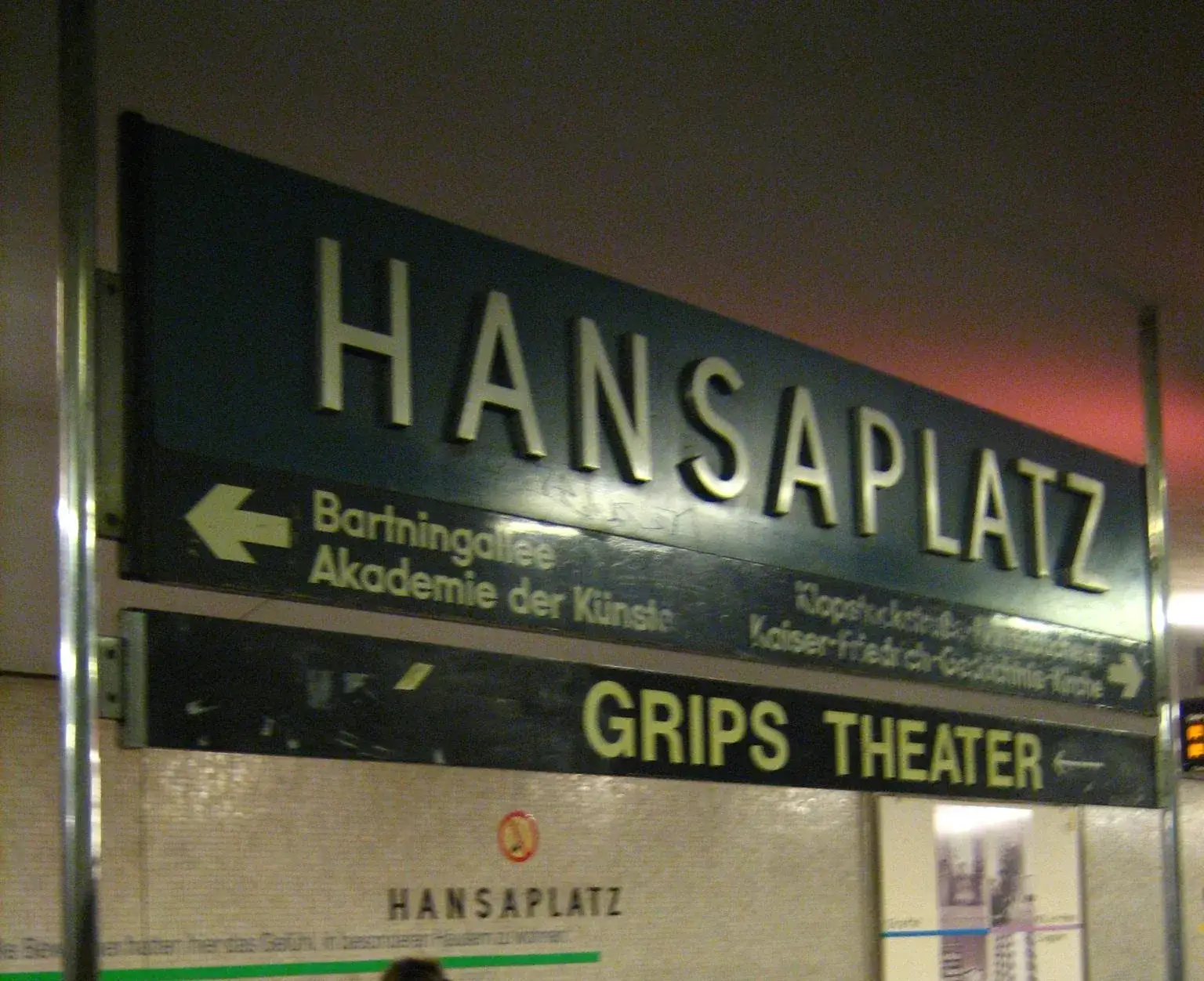
Futura Black Stencil recalls postwar illuminated signage and the breaks produced by stencil construction. Moskau Grotesk points directly to the Café Moskau lettering on Karl-Marx-Allee. Another reference draws from lettering integrated into the architecture of Deutsche Oper U-Bahn station in the 1970s.
ABC Maxi evokes neon tubes and signs around Spätis and snack bars. WT Bobine is associated with West Berlin and more rigorous structures such as Bikini Berlin. Crack brings in quicker, imperfect street writing. CMM Coda references typewriters and bureaucracy. EK Roumald looks toward Gründerzeit façades. Neureal is connected to clubs, temporary spaces and contemporary digital culture.
Not all of these typefaces literally come from Berlin. The museum says so itself. They were chosen because each can carry a story that has a place in the city.
That distinction matters. This is not a scientific inventory of "Berlin fonts." It is an identity system built from an editorial reading of the city's typographic landscape.
One name, two voices
Every logo combines two different fonts.
That detail changes how the system works. It is not merely a catalog of alternate logos a communications team can pick according to mood. The contrast exists inside the name.
One part of "Berlin Museum" can therefore suggest modernist signage while another feels closer to neon, an administrative form or experimental lettering.
The museum says it wants to reflect stories and perspectives in Berlin that complement, overlap and contradict each other.
That is branding language, naturally. A graphic identity does not become a sociology of Berlin because it owns several font files.
The mechanism is still interesting. A conventional identity often treats variation as something to control. This one turns variation into a composition rule.
Consistency no longer comes from one fixed shape. It comes from the protocol that allows shapes to meet.
Barcelona, reversed
Another recent identity makes the choice easier to see.
FC Barcelona turned local visual heritage into one exclusive typeface, FC Barcelona Modernista. The club wanted a typographic form that could become a common proprietary signal across its teams.
Berlin Museum begins with similar raw material, the visual history of a place, and chooses the opposite move: do not merge the references.
Both choices can fit their institutions. A football club needs eleven names and numbers to be immediately recognizable from across a pitch. A city museum can afford a logo that asks a small question before becoming perfectly familiar.
This is not simply diversity versus consistency. It is a decision about where consistency lives.
In Barcelona, it lives in the letterforms. In Berlin, it lives in the rules governing the collision.
The doubtful 81
Some coverage quickly summarized the system as "81 logos."
I would not use that number as a fact.
Berlin Museum explicitly says each mark combines two different typefaces, but its own pages do not publish an official count of all possible permutations. Starting with nine references, different calculations appear depending on whether order matters, repetitions are allowed, or some pairings are excluded.
The arithmetic is entertaining. It does not explain the design.
What matters is that a large number of variants is no longer treated as a defect to eliminate. A dynamic identity can remain recognizable if the viewer learns its grammar rather than memorizing one fixed image.
Keep the contradictions
Berlin Museum already collects objects, photographs and traces of the city. The new identity applies a strangely similar gesture to branding.
It does not ask visual research to produce an average Berlin. It keeps incompatible elements and puts them into relation.
That may be the most transferable part for designers.
When a moodboard contains ten contradictory references, the usual instinct is to search for their common denominator until a cleaner style emerges. Another option is to treat the contradiction as information and invent a system capable of keeping it visible.
That still requires limits. Without a protocol, nine fonts are just nine fonts. Here, the stable name, the two-font rule, the curated type selection and common applications provide the frame.
The logo is not arguing that Berlin has no identity. It suggests that identity can be a collection rather than an average.